Blog
- Details
- Ashley Hanson
Fra
'A great painting is like ice on the stove. It is a shape riding on its own melting into matter and space; it never stops moving backwards and forwards'
Another fabulous 2-day Freedom in Painting workshop in Aylesbury, working with the model and responding to the ideas, work and process of Frank Auerbach. In these workshops, I seem to be working through my artistic heroes: Peter Lanyon, Diebenkorn and now Auerbach, perhaps all leading up to Matisse next year....
An introductory talk on Thursday morning, reviewing Auerbach's career and the roots of his extreme methodology, was followed by an intense 2hr drawing session, including exercises where positive-destruction was encouraged and integral to force the elusive 'unexpected'.

This process of investigation continued into painting, working from a single natural lying-pose, sleeping, not staged, which of course presented particular difficulties and opportunities for the artists at each end of the bed.
On the workshop, the ten artists were not aiming for a pastiche of Auerbach but working towards the ambition of the development of a personal language and the freedom that comes from taking risks and discovery and doing whatever it takes to move the painting forwards. Over the next day and half there were major changes in all the paintings, some artists building up the paint like early Auerbach, others scraping back and starting again, none of the artists holding back in their search for truth.
 Dawn Benson's painting
This was a repeat of the October workshop in Faversham - see here - but with a completely different group of artists and model, with a denser, darker group of paintings emerging. Although familiar with life-drawing, most of the artists hadn't painted the figure before....
A very special thank-you to Hana, our model, and to Antonia and Philip Glynne-Jones for their generous hospitality.
GALLERY

'Loved the whole experience! I was taught lots of new ways of making marks and manipulating paint. Also creating dynamic marks in a painting' Jenny Watts
'The course was very helpful - I feel more enlightened and brave' Brenda Hurley
'Very stimulating and challenging. Worked extremely hard - a great model' Mitzi Delnevo
'Pushed my boundaries' Jane Crane
- Details
- Ashley Hanson

MONDAY p.m.
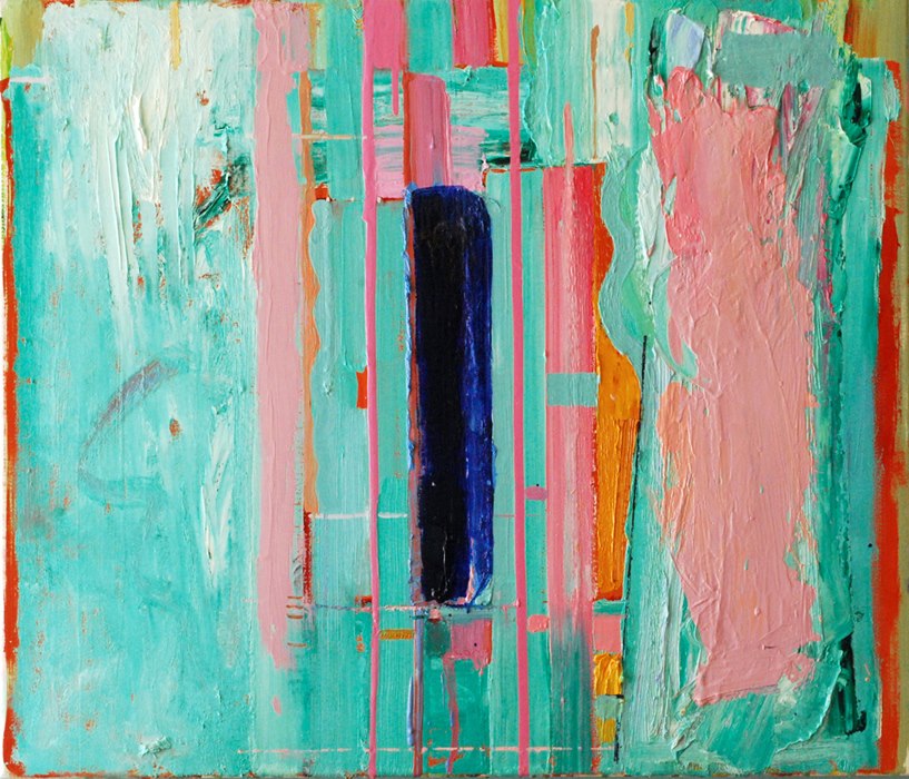
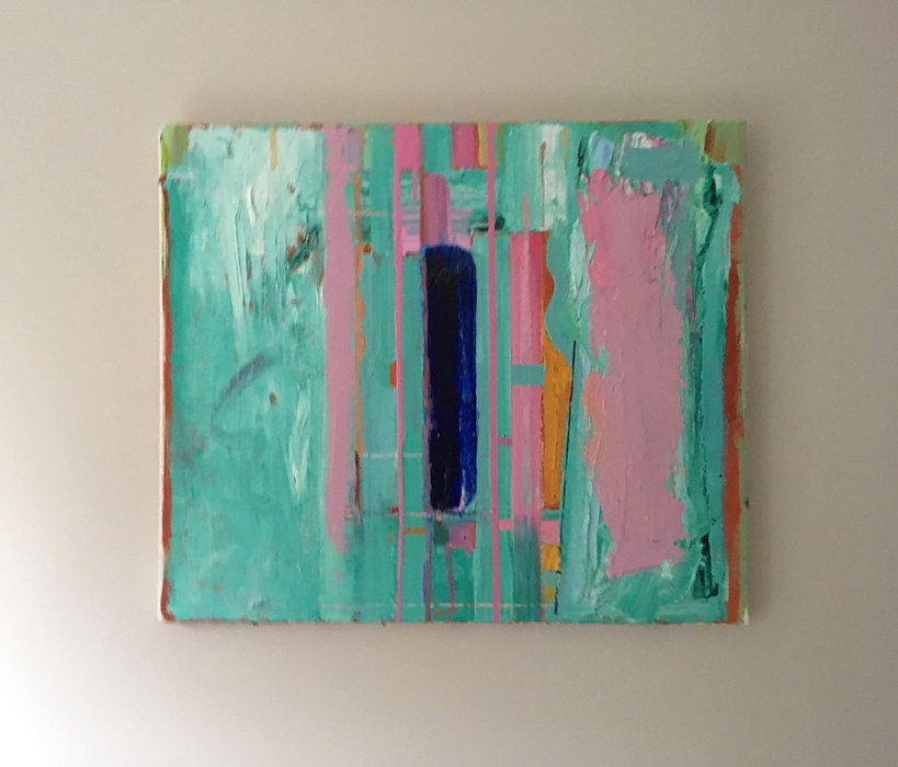
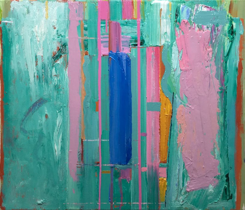
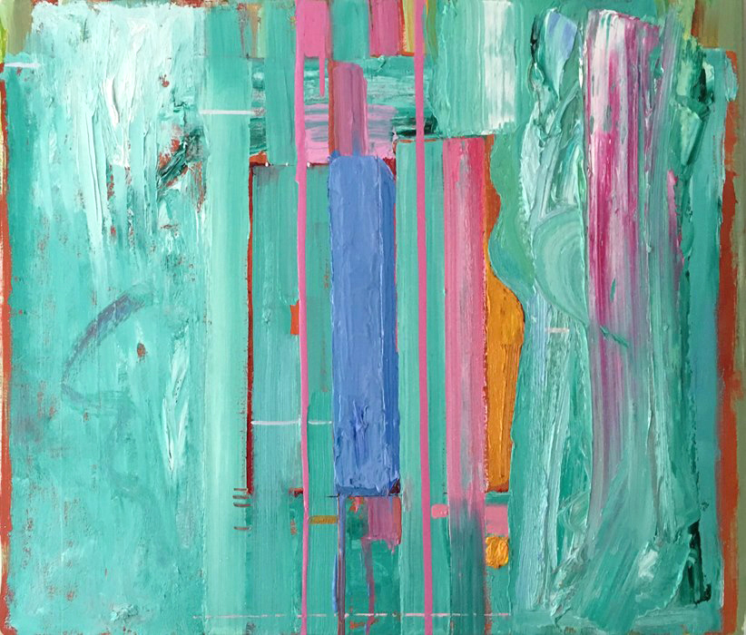
So what do we have? Where are we? The first painting in the new series '20 Books = 20 Paintings', a visual response to the crime-novels from around the world that I read incessantly, bringing that part of my life into my artistic life. The source novels will be not be revealed providing, I hope, an additional layer of intrigue for the viewer. If they wish, they have the option to become a detective themselves and follow the visual clues in the painting which lead to the identity of the novel.
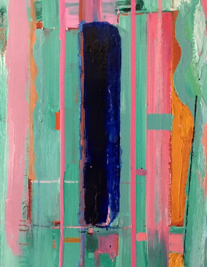
From my point of view - working within the criticality of every element working for the painting - the series provides the new challenge and discipline of what not to include in both the paintings and in my writing. A balance between making the identity of the place and novel too difficult or too easy to discover. In this piece, I held back an image because I didn't want to clutter the painting but also because it may have made recognition of the place too obvious. What I can tell you is that the palette is significant to the place as are the specifics of the grid(s). If you know my work, map-view and image jostle side by side and a colour-reversal is not uncommon....There are different scales in the three sections: the majesty of painting allows this to happen seamlessly. It is hierarchial: what is important in this painting? HINT: the novel is fiction built around a real event and the location of where the victim's body was found a focal-point. Two other important locations are integrated in the piece.
I talk too much about that side of things. This is a painting that works: beautiful colour, heat, ideas, intuition, precision and balance. I'm enjoying the realationship between the cut and painted lines of the 'candelabra' and the canvas-divide and the more subtle verticals on the right-side, almost a faded mirror-image, reflecting the symmetry I was looking for. I would happily put it alongside 'Lakeshore Ltd' (below). I think Denise has come around - she was very fond of the painting on Friday.

MONDAY 12 noon
And the mark was purple - to counteract the rigidity that was creeping in. Central line softened....better: the 'right' weight.

MONDAY a.m
A new yellow around the 'candelabra', a strengthening of the lines. Also a re-introduction of the horizontal - perhaps it should be more of a suspicion of a line...glaze over? It's a mark away from being resolved...keep looking.

SUNDAY
Not sure this works. cutting into the paint has made the surface lumpybumpy. I miss the purity and freedom of the central paint from yesterday. Also tried a painted line, picking up the green - no good. Don't know if the image?/candelabra?/tree? is too weak, too strong, or even in the right place. It has to be in the painting but just doesn't have the presence I'm after. Impatience: I'm tired, I went in the studio after working this morning. It might look better in daylight.

saturday 4pm
SATURDAY 4PM
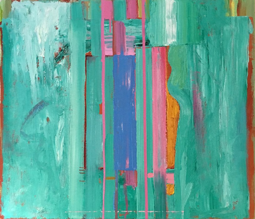
Now we're painting! Positive destruction, simplification...a frenzy of colour-mixing and pouring/skimming...suggestions of cityscape...now the option to move the candelara off-centre into the flat yellow, precisely drawn in paint, a slightly smaller scale. Black or cut-back to the green or even to the yellow underneath? When the candelabra was centered below, the dividing line was hidden and the idea of a book was lost and the painting too graphic and flat.
Looking back on the previous versions, the main horizontal was always too high.The paint needs to settle down but I think we're getting close.
 saturday 2pm
SATURDAY
There's the contrast...and the crisis. The only positive with these moves the blue rectangle on the right.

friday
FRIDAY
Only a short session possible today. We have orange and scarlet(t). The painting is opening up now - lots of possibilities. Denise and Faye have been speculating about location and what's in the painting - Faye saw a bottle, Denise a tree - maybe... Denise recognised the palette from 'Lakeshore Ltd (& Jon's Barn')', below, from the 'A m e r i c a s c a p e s' series. It's always been a favourite with its' startling colour and the confident drawing of of the Great Lakes, appearing vertical. Also the idea of having both the map-view and painting of Chesapeake Bay (propped against the barn) in the same piece. It's good to see this painting again- it shows what a long way to go there is with the new piece which lacks contrast and precision.
 'Lakeshore Ltd (& Jon's Barn)'
 thursday
THURSDAY
Disruptions to the flat picture-plane, the vertical-lines at the top almost a receding-space. A twist of space. Adjustments of colour, line & scale...liking the palette and colour proportion. The 'candelabra' will take centre-stage...red-herring?
In comparison to the flatness of the version below which looks like a fragment of something else, like wallpaper, the painting is already starting to feel self-contained, with the large green-shape - silhouette? - framed by yellow, and visual journeys within and around the piece.
 wednesday
WEDNESDAY
The new series begins: '20 Books = 20 Paintings'. (See Blogpost: 'An Announcement'- the next series')
This novel was always on the list. Scrubbed Indian Yellow, dark yellow jigsaw-shape and lines. Already questions: is yellow significant? Image or location?...already jostling. Sun? Candelabra? Subversions of scale...symmetry/duality...all clues to the identity of the novel. Perhaps I have said too much. This writing already different: what not to say?
Like in a chess game, I can visualise the painting a few moves ahead but not beyond. After all, the idea of a painting, a pre-determined painting, is a fake painting; it doesn't factor in the joy of painting, of discovery & chance, sensations of colour against colour, subtleties, surface, shifts in ideas and design.
Lets see where this goes, with more paint to work with. Green-grey next:colour-hum.
- Details
- Ashley Hanson

SATURDAY
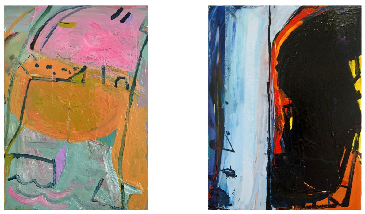
That's better: a new photo with the Nikon, truer, more vibrant colour, not enough light yesterday. Dreaming of the piece in the night, what I might do. No need - it works, why embellish? It's dynamic and punchy, the confident, moving, open brushwork on the right reinforcing the theme. Love the hot triangle, bottom left - what an anchor! - thrusting forwards of the black..except it's behind. Blacks are coming into my work more and more. There is a strong link to 'Black Harbour' from October, -- this time the idea of harbour is the negative space - and, subconsciously, to Robert Motherwell of course. The idea of harbour; refuge or escape. Might take this idea of the open-diamond, scaled up, into a new painting.
FRIDAY
A down and up day in the studio....from the more illustrative 'harbour' below, to the idea of harbour, the openendedness, something more specific...Two shapes dancing, joining/closing with a brushmark, the one on the right, more deliberate, paint pushed and adjusted. The shape on the left, more accidental, formed by gravity, the canvas at an angle, watched carefully after the original action and placement.
 'Black Harbour'
 beginnings...
- Details
- Ashley Hanson
TUESDAY
New pleasures and observations, a different wall, beautiful light, the pinks warmer, zinging, holding their own more against the dark-blue... it's a wonderful thing if a painting can continue to please, change, provoke thought over time. A days' distance from the deliberation of painting the idea...sensation:colour against colour, the intuitiveness of the placement of the large green block on the right of Central Park forming an invisible necessary horizontal with the thin red shape on the left. Above the orange, the rightness and crispness and purity and criticalness of the double-curve (in the same green), forward against the red: without it the painting would dissolve into mush. Try it - cover it up with your finger. All the horizontals and blocks/blobs/colour seem to have the right controlling weight. Ideas and intuition in sync. QUESTION: what am I looking at? ANSWER; many things....The painting is also intimidating: an artist has to do it again in the next piece..and again...'the fear and thrilll of the chase....'
MONDAY
Looking at the painting again this morning, the excitement cranking up further: The Book is Central Park is the Tower(of Babel) is the dark-blue of night is the Book. Quadruple-meanings and possibilities...the verticality of New York captured...map-view, street-view, simultaneous. The New York canyon-thing, the Book is the negative space between buildings... the organic marks a crowd, people moving through space.... Painting Truth.
SUNDAY PM
The book that inspired the series* is now in the painting, is the subject of the painting. It sits - a powerful presence, it's hard to look anywhere else. The Book is Central Park is the Book. This duality is the essence of the piece: flitting from one interpretation to another, impossible but exhilarating. The book was scraped-back and repainted several times today until I found that critical tipping-point where paint is something, gains an identity or even has the possibility of being something. One more brushstroke and the paint becomes illustrative and grabs too much attention, discordant in the language of the whole. That's why having the book title down the spine didn't work. Glazes of ultramarine and alizarin, now a convincing shape, monumental. The colours are working for me.
The Book is Central Park is the Tower (of Babel) is the dark-blue of night is the Book
 Sat p.m
SATURDAY P.M
Denser, weightier blue, book-form emerging, 'side' and perpective suggested by two tiny triangles...pink onto green - love the large writhing pink-mark on the right-side- 'organic', near-rectangle, echoes the blue...hovering, coming forward, making space...Manhattan elusive - hinted at, defined? by specific shapes and proportions and the new dark angled line edging the orange, now extended...'there but not there'- the mantra for the series
It's open, ambiguous, exciting - the book/park still a slab of paint with a mere suggestion of form. To shake up the painting, I have to try putting in the title the title and author's name down the spine - another downward movement- to see if the painting looks ridiculous or, because of the source in text, it gains an edge.
Getting deeper into painting.
 Sat a.m.
SATURDAY A.M
Some wilder marks on the right-side, lines of movement linking to the curves. The park/book now having a physical-presence, beginning to sqeeze out from the surround. A few horizontals to bring some order & stop the eye sliding out of the painting. The cluster of horizontals/streets, piers and blobs underneath the park/book looking interesting...
 Friday
FRIDAY 24 NOV
It's good to be working again...this is the painting after the first session, on a red/orange ground. The idea has been around for a while...I saw that Central Park was the same proportions as the spine of my copy of 'The New York Trilogy' or any book. In this painting the Park will be the book, an image painted graphically, near life-size. Lets see how it sits in the language of colour and mark-making that surround it. The challenge is to make it work- the illusion of being able to grab and slide the book out but from what space?
The blue/park/book not yet right- needs to be more ultramarine. Underneath is a pink to further drag through tomorrow. It has a presence. Early days.
*'The New York Trilogy' by Paul Auster
- Details
- Ashley Hanson
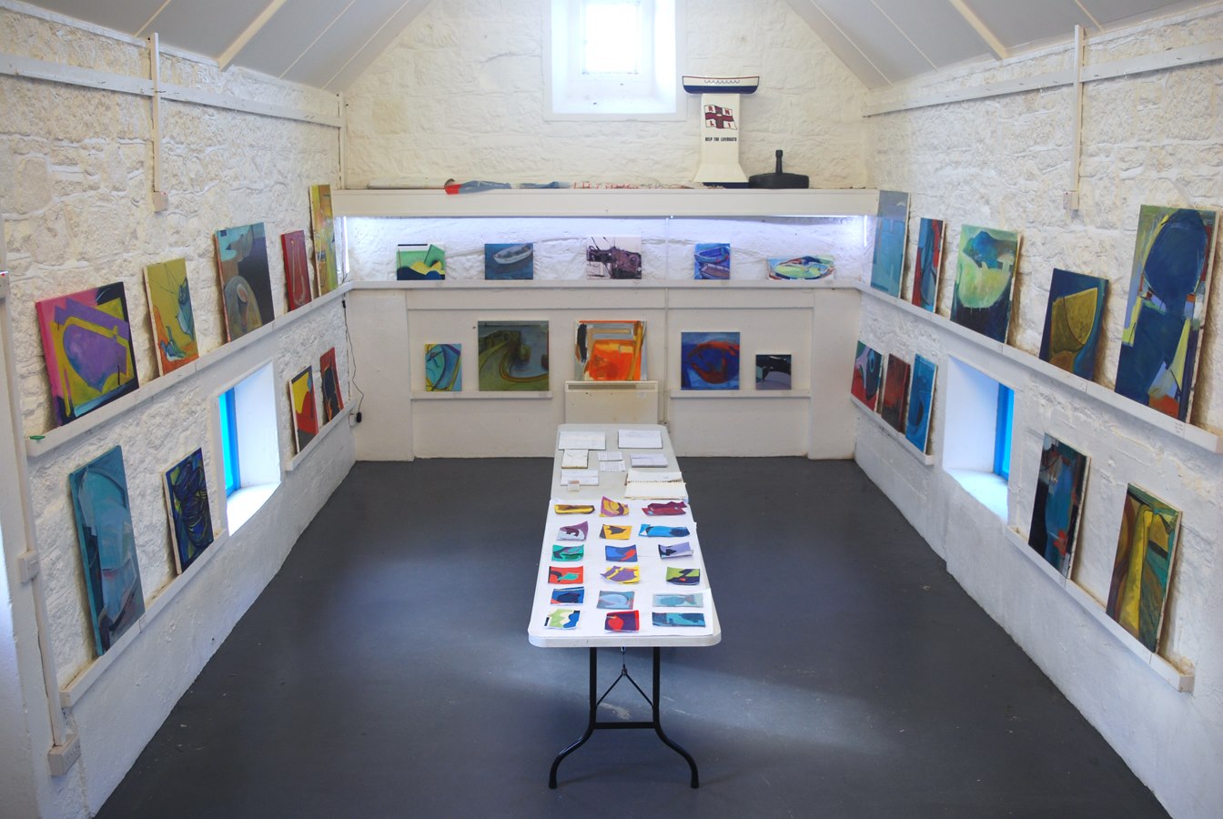
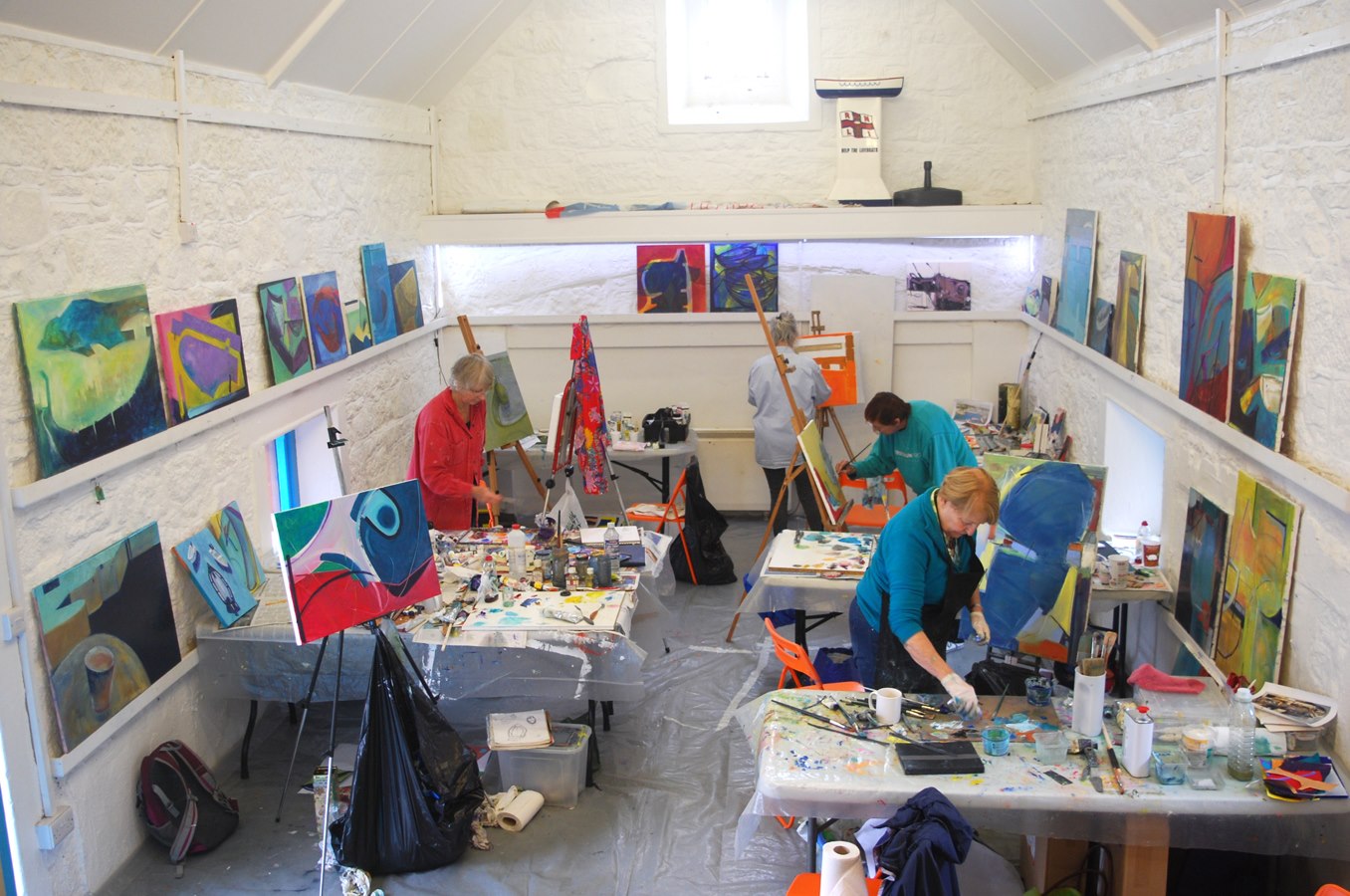
I recently hosted two back-to-back Freedom in Painting courses in Porthleven, welcoming artists from all over the country. As per usual, each course ended with a one day exhibition in our studio at the Old Lifeboat House, with its fabulous location at the the harbour-entrance in Porthleven.
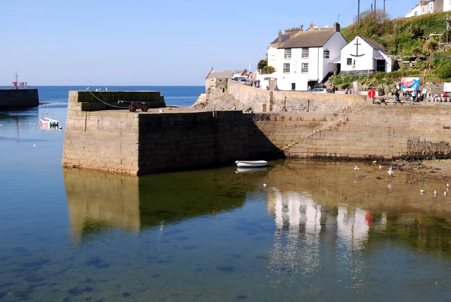
Early morning in Porthleven: the Ship Inn with the studio just beyond
Each Porthleven course has a theme, this year it was 'Curve & Boat', which caused a couple of groans when the theme was announced! The artists were introduced to a range of images exploring the theme, including Van Gogh, Munch, Kandinsky,Dufy, Matisse, Patrick Heron, Terry Frost, Bridget Riley & Ellsworth Kelly.
Both courses followed the same-format with a mornings drawing session around the harbour, working with the theme and searching for ideas for paintings. Following the theme, on our gallery day this year we visited galleries in Penzance and Newlyn, with further drawing sessions around both harbours with different shapes and larger boats.
We saw some fantastic paintings by Jeremy le Grice at the Tremenheere Gallery and paintings and inventive collage by Robyn Denny at the Newlyn Art Gallery plus some inspiring work by contemporary Cornish artists.
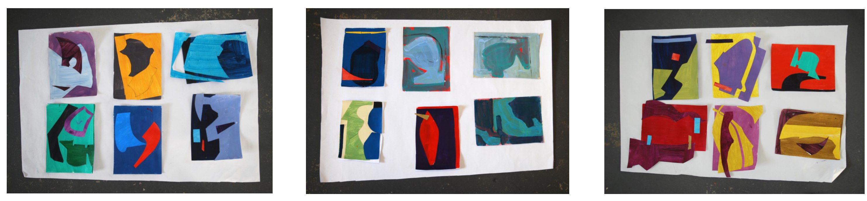
The group-exercises this year included starting a painting with twelve curves, each different in shape, weight, colour or execution. On another, the artists worked with paper, using shapes taken from the landscape, which then became a template for a painting.
There was an amazing work-ethic in the studio, inspired by the beauty of Porthleven with the sound of the sea through the open studio door. No-one can expect to resolve a painting in a couple of days but the quality, quantity and range of work produced was a revelation. There was plenty of socialising in the evenings aswell, often with the artists returning to the studio after a visit to The Ship next door.
As always, exciting times when the studio is cleared and the paintings revealed for the exhibition. Congratulations to the 14 artists!
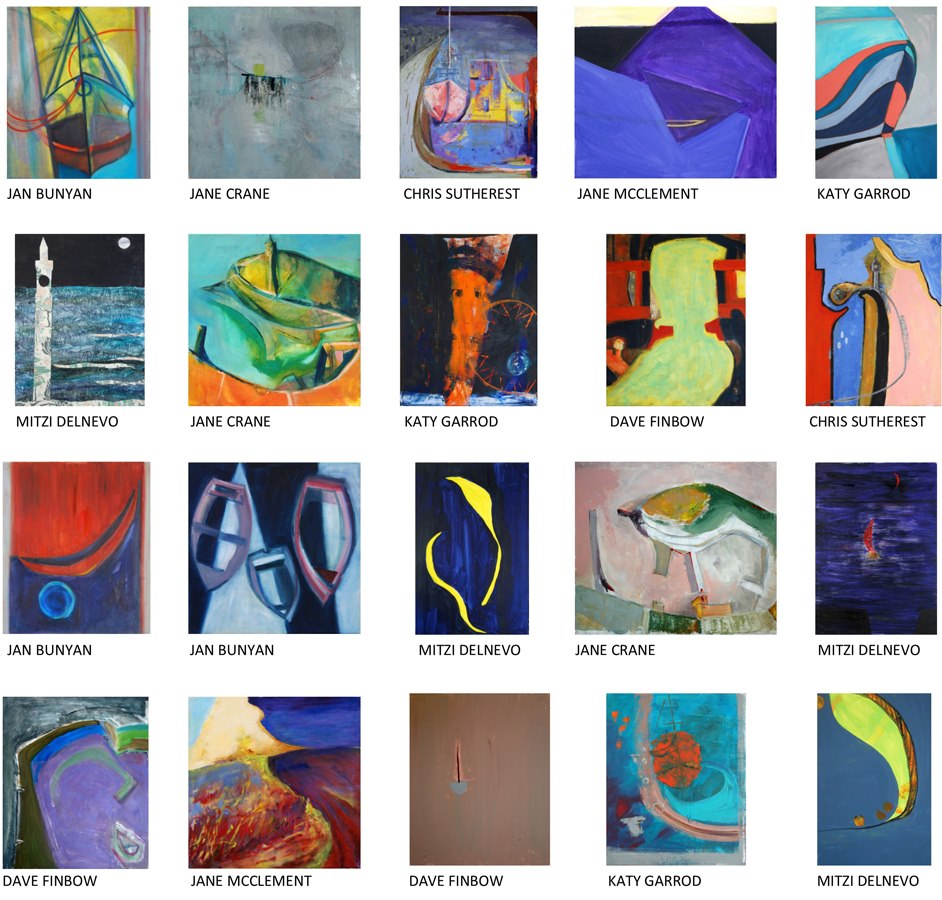
GALLERY: 1 - 6 OCTOBER COURSE
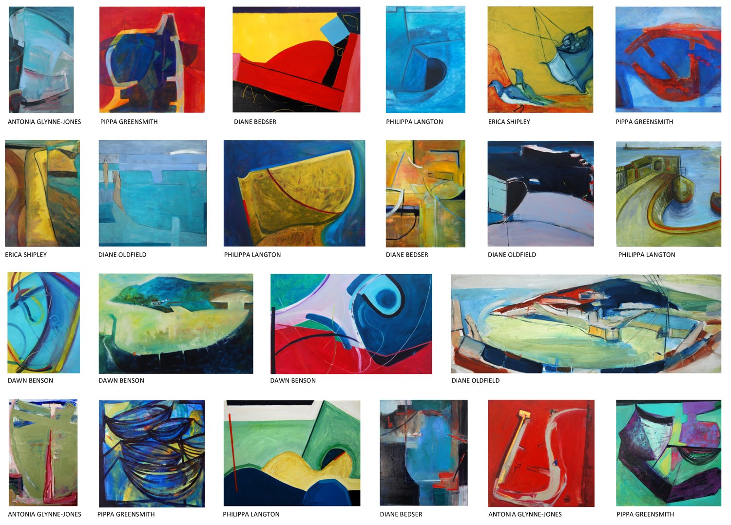
GALLERY: 7 - 13 OCTOBER COURSE
 Porthleven 30 Black Harbour
My two paintings from the October courses.