Blog
- Details
- Ashley Hanson
 'City of Glass 9 - (Fiction & Fact)' 120x200cms
As the 'City of Glass' series nears completion - there is a final idea to explore - and after a time of reflection, I would like to announce, in advance, a new series '20 Books=20 Paintings' which I aim to complete by 1 September 2018. A year to find a gallery to show the series as a coherent whole. Materials are ordered: each painting will be 45x70cms.
In a shift from 'City of Glass', each of the twenty paintings will be sourced from a different novel, whose identity will remain a secret. If the viewer wishes, there will be clues in the paint and if you know my tastes....
Each of the pieces will be in the 'book-format', ie two canvases joined together, referencing both the genre and the painting as 'object'. This was a favoured format in City of Glass; see 'Fiction & Fact' above and the paintings below. And of course this years 'WestSideStory' and 'EastSideStory'.
In paralell, there will be a continuation of work inspired by the sea, the shapes and imagery of harbour-towns, the sensations of light, weather and colour. This is a lifelong series. As a discipline, I think I'll continue with the idea of a block of colour in the bottom left corner that links 'The Sea' and 'Crane (Polruan)' below, which establishes and controls the space.
 'The Sea' 70x70cms 'Crane (Polruan)' 40x30cms
 'City of Glass 10 - (StillmanStillman)' 120x200cms
 'City of Glass 5 - (Truthville,N.Y.) & City of Glass 4 - (Hope Falls, hope falls...)'
 'City of Glass 11 - (StillmanStillman)'
 'City of Glass 32 - (The Apartment)' 70x100cms
- Details
- Ashley Hanson

PAIRS/OPPOSITES: West-Side/East-Side...sensation and context...information and imagination...'map-truth' and 'painting-truth'...natural and the man-made landscape...male/female..
- Details
- Ashley Hanson

City of Glass 62 - (WestSideStory) 40x60cms
SAT 17 JUNE
A sad day and a good day - the end of Open Studios and the resolution of my painting. For the title I've gone for the WestSideStory and all the baggage that goes with it, but I like the link to the book-format of the paintings and to the novel.*
Conversations today: an American couple talking about the new work, joining the debate about City of Glass 61 & 62 as a pair and how wide the gap between them should be....a comment from another artist about this piece '...making New York beautiful, moving away from the ugly, drooping willie of Manhattan' (!)
Back to the painting: saturated colour, working in density and proportion. The dominant verticality/stripes is disrupted but more visually satisfying because of it. The backward step with the green at the end of yesterdays session forced me to look again at the purple. What is detail? It is what happens at the end of a painting to bring focus and refinement and difference and added complexity and above all, clarity. The addition of snaking Broadway helps the painting a lot - the curve of Riverside Drive no longer stark and isolated. A small area of heavier, knifed purples to break up the flatness... a pattern of 'hovering' green printed city blocks... a new yellow glow on the extreme right ... an almost hidden long 'banjo-pier' shaped mark, revealed again by scrubbing away , now contributing....a long central horizontal, coming forward, cutting the space, pulling the two sides together...lines/marks with beauty and precision, formal necessity and context...triple whammy...the streets where Stillman walks, the boundaries/borders of 110thSt, Riverside Park, 72ndSt and Amsterdam Ave.
With the twin purple angled piers there are possibilities of the illusion of a receding space, the New York canyon thing again, the idea reinforced by cooler colours 'beyond'. The view through buildings...are we getting closer to depicting Quinn's observation post in the alley, watching the entrance to the apartment on E69thSt?

detail

In the studio
FRI 16 JUNE
Still have doubts (below )- the left panel seems more successful, the right almost decorative and too linear, the angled purple piers cancelled out by the twin paralell lines to the right. I've been putting in detail/information/references to the story all day to find out what they do to the painting and whether the painting needs them. Feels like there needs to be a further paring down. Tried a green at the end of the day, making a connection with 'EastSide' which didn't work, Maybe it's too much of a fixation, trying to make paintings work as a pair.

Friday
 day 1
day 1
* The New York Trilogy' by Paul Auster
- Details
- Ashley Hanson

City of Glass 61 - (EastSideStory) 40x60cms
THURS 15 JUNE p.m.
Done - the big move was made this morning. An extension of the horizontals on the left and repainting between the lines to bring more precision. A new green line coming up from bottom centre and a bit of colour tuning and tidying up. Colour proportions sublime...a balance beween the small coloured rectangles on the left and the ripped paint on the right. Drips that could be avenues. A painting from a story that has its own story and it's own language. It's a book that doesn't close - it's a painting.
THURS 15 JUNE a.m.
It's happening- the two sides closer together..a Cerulean Blue and Sennelier Mineral Violet mix- the edge of blue- poured. smeared, scraped and cut...

WED 14 JUNE
I seem to have spent more time thinking than doing over the past couple of days with this pair of 'open/book' paintings, a direct reference to the source for the series.* In this piece, the idea is to integrate the grid of the book (the ruled lines of Quinn's notebook) with the grid of the streets of the Upper East Side. The other painting will be the streets of the Upper West Side, the two locations, of course, significant in Paul Auster's story. In both paintings, the horizontals- the streets and ruled-lines-will be prominent, which is starting to happen in the top-left of the painting above, where Central Park is defined by the absence of verticals. Embedded in the grid is the route of Quinn's journey home when he finally runs out of money and has to abandon his surveillance of the apartment on E69th St. All a bit raw and clunky at the moment but I like the way the curve straddles the canvas divide. Is it a painting?/is it a map?/ is it a book? I can see the right-side covered with a sheet of beautiful pale-blue tomorrow, leaving a trace of the line of the curve, and the extended horizontal lines cutting through.
An earlier idea was to have Central Park as the negative space between the canvases...(below)

Day 1
*'City of Glass', the first story in 'The New York Trilogy'
- Details
- Ashley Hanson
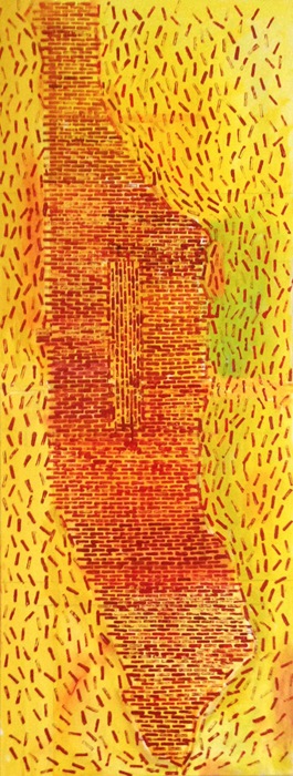
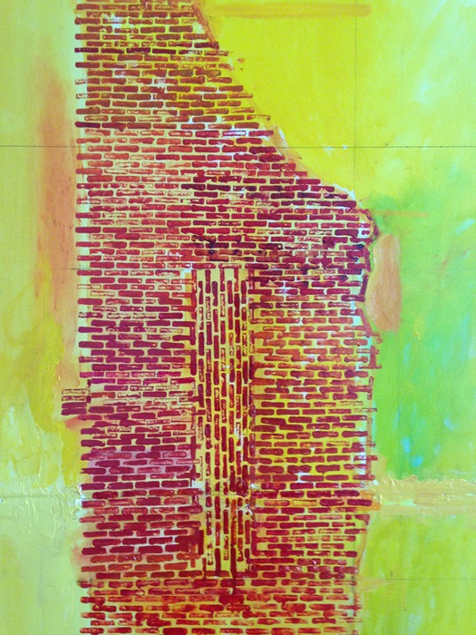
'City of Glass 60 - (Island of Bricks)' 180x70cms
SAT 10 JUNE 4pm
Finished! One of those frenzied sessions heading to a resolution. I'm exhilarated and exhausted. Ancient bricks: blood reds, lipstick reds, earth-reds, iron-oxide reds, scarlet, orange reds, crimson reds, the bricks all different in colour, shape and solidity. The painting is different: it's beautiful, it's slightly disturbing, uncomfortable to look at, the marks around the island like a swarm of angry bees. It's a breakthrough piece, made with one small block of wood. Thanks again to Janie M McDonald for the suggestion of printing the bricks. Scale and orientation ambiguous and indefinable...Talking about the piece, Janie pointed out that the bricks can be also be read as a pathway, a cobbled street, connecting to the journeys of Stillman and Quinn that litter the story*
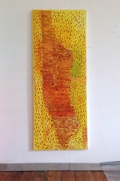 studio
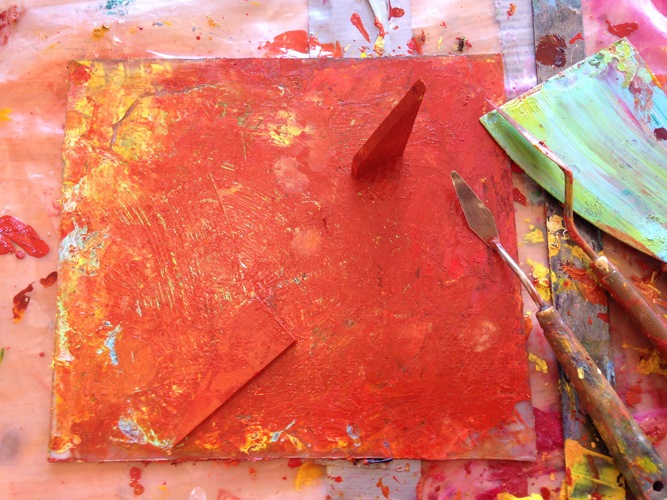
tools
SAT 10 JUNE: 1p.m.
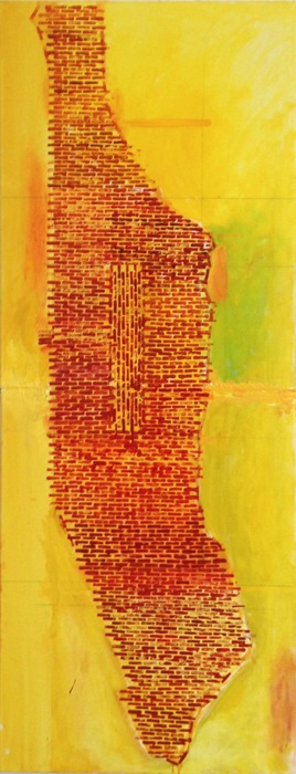
Finally reached the bottom tip of Manhattan - I can finally see the Island of Bricks, a thing of beauty. Central Park was filled in with vertical bricks- now a subtle presence adding to the weight of the island. I now need to work the space around...marks of movement?
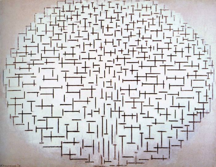
'Composition No.10 Pier and Ocean' Piet Mondrian
FRI 9 JUNE
A possible large-scale finale to the series....another idea that has been around for a long time....
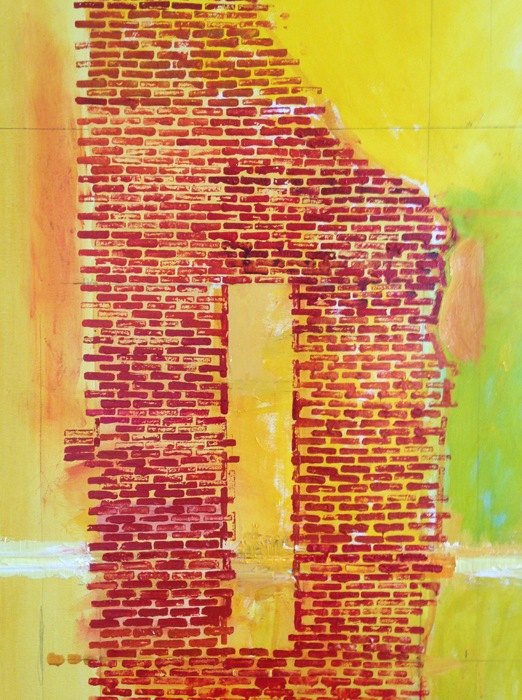
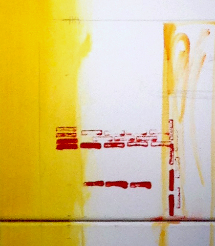
The enormous scale of the (imaginary) new Babel in New York - (Once completed, the Tower would be large enough to hold each inhabitant of the New World. There would be a room for each person..' ) - has been explored many times in the series but this new piece puts the scale into (un)imaginable proportions: 1 brick = 1 city block. In a conversation with Janie M McDonald in our shared studio at the Shire Hall, she came up with the idea of individualy printing the bricks onto the canvas and so appropriately I've used one of the wooden wedges used to tighten the canvas as my printing block. It's a laborious process, working close in, but already a striking image is emerging. Looking forward to reviewing the painting tomorrow late morning when the bricks reach the bottom tip of Manhattan, but already I'm thinking of filling in Central Park with vertical bricks (remeniscent of Mondrian's fabulous 'Composition No.10 Pier and Ocean)' to increase the sense of weight, with marks suggesting movement (using the same block) around the island.
 window..
the first bricks are laid...
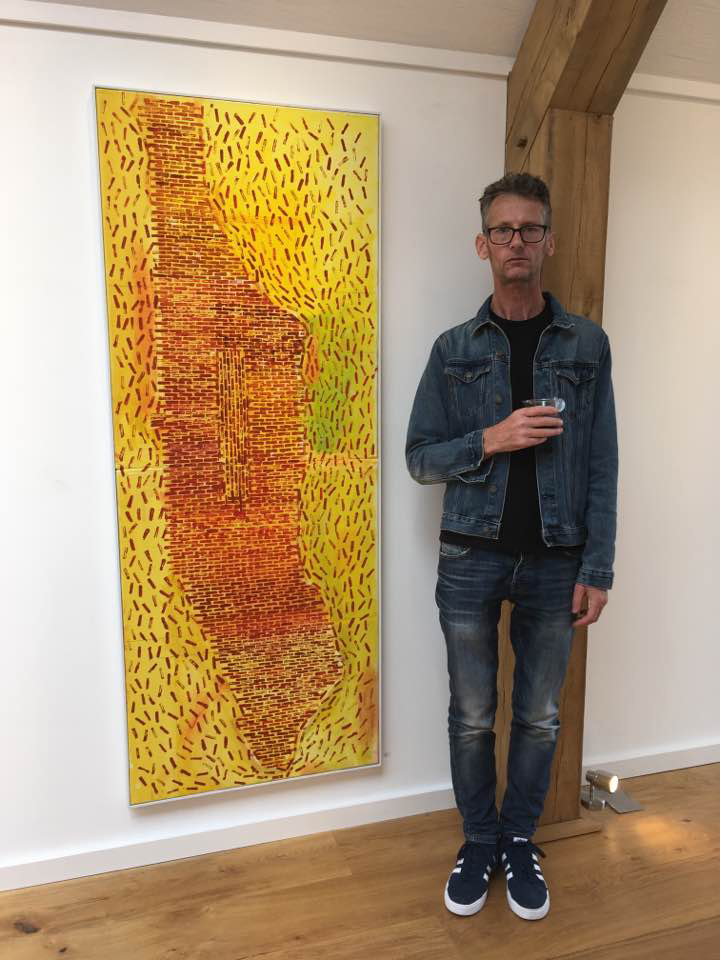 'Critic's Choice', Newlyn Society of Artists exhibition, Tremenheere Gallery
* 'City of Glass', from 'The New York Trilogy' by Paul Auster