Blog
- Details
- Ashley Hanson

City of Glass 59 - (DQ WW MW) 60x50cms
Feeling confident, reckless, after a weeks painting, playing the game of chance, I opened my copy of 'City of Glass' at random: the next painting would come from what was on the page. It was p:62, the red notebook again - a memory came of a previous reading, Quinn writing his initials on the notebook, DQ. Over a pint, I had the idea of also including the initials of author's Quinn's pseudonym, William Wilson, and his fictional detective Max Work, the 'triad of selves' that Quinn refers to at the beginning of the story. 'Triad of Selves' would also make a good title. Need to clean some brushes for todays session ion the studio - small ones for the tiny initials in the top-right corner.

- Details
- Ashley Hanson

City of Glass 58 - (Noir) 120x80cms
Resolved and a new title: Noir refers to the colour and to the genre. This morning I tuned up the dull-reds, picking out the strange shape, just below centre, that hovers forwards. The panel in the top-left was painted yellow, now balancing with the blue shape that anchors the painting. A transparent ultramarine was washed over the tower, sweeping around the tip of Manhattan, enriching the colour and softening the edge. A few tweaks of horizontals and verticals, opening up the space. The grid in the bottom-right now extended, no longer isolated, the open brick-shaped rectangle the same proportions as a typical city-block.The extended vertical up the right-side left open, deliberately. Enjoying the whoosh of the dragged mark from the bottom right corner, the dynamism, the variety of shapes and paint, the light, the subversions of scale. Thoughts of Mondrian: Grid, Red, Yellow, Blue, Black.

detail

twins

Thursday
A good day in the studio - a scary white canvas this moning. Another version of AusterAuster about a journey from fictitious Paul Auster's home on Riverside Drive to 'real' Paul Auster's home in Brooklyn. (see yesterday's Blog) Things are happening. A similar composition with the long diagonal linking the two locations but this time the left-side is a building. I'm enjoying the seamless transition between the building and the plan-view of Manhattan along the diagonal and the play between the stepped profile and the curves on the east side of the island. The intersection of the diagonal and building is poweful and deliberate: they meet on the 11th floor where the 'fictitious' Paul Auster has his apartment.
A mix of geometry and movement: again a rhythm of triangles and a swirling, boiling black sea around Manhattan, shiny, luscious barely photographable. A word? Strange space and perspectives - the New York canyon thing but between the buildings is...Manhattan. The Tower of Babel implied by the steps and triangles along the diagonal...there but not there...
It's raw, it's exciting, it's different - is it enough?

detail

in the studio

beginnings
- Details
- Ashley Hanson

City of Glass 57 - (as the crow flies...) 120x80cms
Great to be painting again in Open Studios. It's over a year since the last City of Glass painting but I've had this idea for a new piece for even longer...
The story 'City of Glass'*, begins with Quinn taking a phone call from someone asking for the Auster Detective Agency. When the phone rings agan a couple of nights later, Quinn pretends to be 'detective' Paul Auster, and takes on the case. Author Paul Auster also places a character 'Paul Auster', a writer, in the novel, whom Quinn visits, giving the location of his address on Riverside Drive, between 116th and 119th street. Continuing the ideas of journeys and the record of journeys in the novel, and extending further the blurrings between 'fact' and 'fiction' that run through my series, the idea behind this piece was to make visual a journey between fictitious 'Paul Auster's' home to 'real' Paul Auster's home in Park Slope in Brooklyn. Looking at the map, and drawing a line between the two locations, I picked up on the dynamism of the angle created and decided to use it in the painting - a journey as the crow flies...
Planning ahead, (and linking to an exercise on the recent Port Isaac course, where, to force dynamism, I asked the artists to begin their painting with a corner to corner painted cross), I started this piece with a top-right to bottom-left diagonal, it's traces now almost hidden but critical to the painting. I moved my 'journey-line' several times until I was happy with the position. (In 'reality' Park Slope is the shape to the left of where the line ends, but ending there, while more 'truthfull', was visually,not as satisfying so the line moved). Three main colours: orange from Indian Yellow and Venetian Red, a Magenta and Venetian Red mix, and a Cerulean Blue and Viridian turquoise. A new colour, Michael Harding 'Brilliant Pink' to add intensity.
It looks different, more fragmented than usual, but I think we are done. The space is open and ambiguous, including a mixture of painting grid and street-grid. Rhythms of triangles, jewels of colour and incident. Had one of those days where every change, every line, every colour works out, strengthening the painting. I'll start another version today where, as a finale, by manouvering the canvas, I shall guide a line of liquid-paint between the two locations, across Brooklyn Bridge....There could be a series of different journeys, different routes across different bridges in the painting.. we'll see.

detail: Brooklyn piers
* from 'The New York Trilogy'
- Details
- Ashley Hanson
Congratulations to the twelve artists who came on our recent Freedom in Painting course in Port Issac,Cornwall, a new venue. Their response to place, the landscape and the challenges resulted in a very strong body of work. The artists were a mixture of all abilities and experience with some new to painting. You may be able to deduce that some of the exercises were about 'frames' and the space between piers...

Trebarwith Strand
The first day was spent on location at Trebarwith Strand and Port Quinn two of our favourite places. The sea was wild at Trebarwith, crashing against the black rocks. With a mixture of group exercises and personal study the objective as always was to capture the essence of a place through drawing and to find ideas for painting. The brooding presence of Gull Rock became the subject of many of the paintings later in the studio. We had lunch at the Port William Inn, just above Trebarwith, with it's fantastic views of sea, before heading out to Port Quin, dramatic in a different way, with its clifftop views and sweeping 360 degree panoramas.

Port Quinn
On the second day we worked in and around Port Isaac, on both sides of the harbour and in the fascinating narrow backstreets, seeing the village from all possible viewpoints.
 Port Isaac - Erica sketching from the pier
The next three days were spent in the studio, using the drawings and studies and the group exercises as a springboard into painting. We all loved the studio in Port Isaac Village Hall - well-lit, sea-views and a garden outside. At the end of the course, as always, we ended with a group critique where we could see their paintings properly for the first after the studio was cleared and the artists receive invaluable feedback on their work. Hope we meet again!
 In the studio

Demonstration
 Port Isaac - the artists
GALLERY


Janet Gervers
Testimonials
Thank-you for a stimulating week. Really enjoyed it and will move forward with my own work now.
Francis Beaumont
Learned some useful techniques and more info on how to look and see. Felt useful to be stretched and moved.
Dawn Benson
I found it very helpful - I am trying to use abstraction in my work and feel a little closer every course - but can not work from nothing- there has to be an element of drawing- observation.
Kate Watkins
- Details
- Ashley Hanson
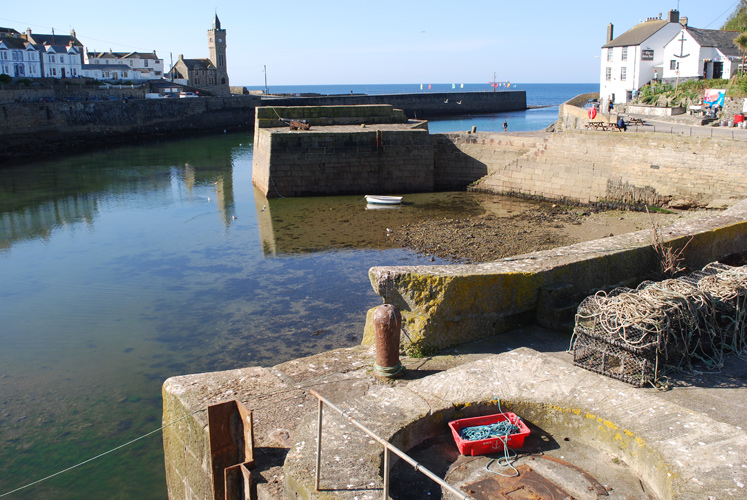
View from the temporary bridge
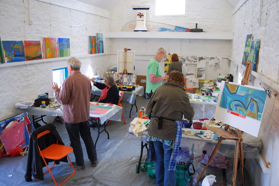
Following on from the recent courses in Faversham, our spiritual guide for the April Porthleven painting course was Peter Lanyon, whose lifelong search for new perspectives ended tragically with his early death in a glider accident in 1964. We met at the studio early Monday morning, and after a talk about Lanyon's life and work we set out with a twin purpose: to get to know Porthleven through drawing and to search for ideas for painting. The afternoon painting session in the studio was intense with three different exercises geared to start three paintings in different ways. One began with colour, one from abstracted drawing, the third a drawing in paint of the harbour from memory with the discipline of a blue stripe down one side and a horizontal divide.
Tuesday was a gallery day. After seeing Jessica Cooper at Kestle Barton, whose work inspired many of our artists, we visited Tremenheere and had a top lunch before going to see a Gillian Ayes print show and an exhibition of sculptors' prints, 'With Space in Mind'. A personal favourite were the Anthony Gormley etchings of the figure. Then we went off to St.Ives where the highlight was a fine exhibition of St.Ives artists at the Belgrave Gallery.
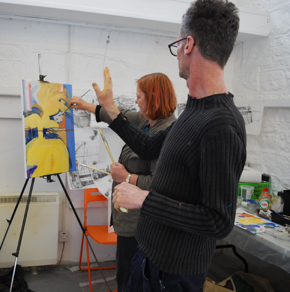
Wednesday morning began with a half-hour demonstration where I began my own Porthleven painting, inspired by the yellow gig on the walk to the studio. With the Lanyon talk, the drawing, the exercises and the many wonderful pieces we saw on Tuesday, the artists were now fully primed for painting. Over the next three days the artists worked incredibly hard, moving their paintings forwards, working towards the exhibition on Saturday.
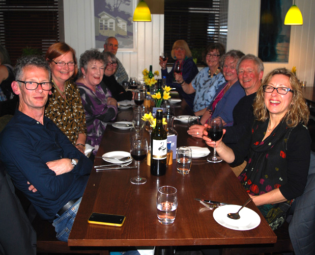
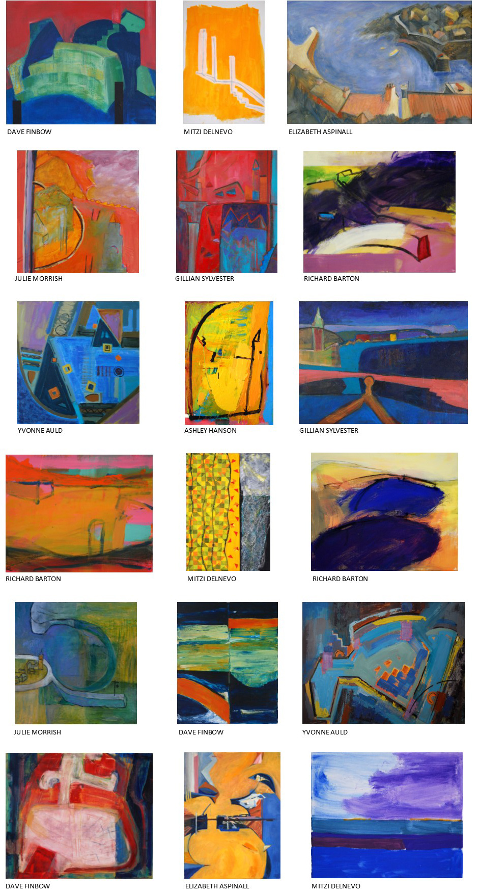
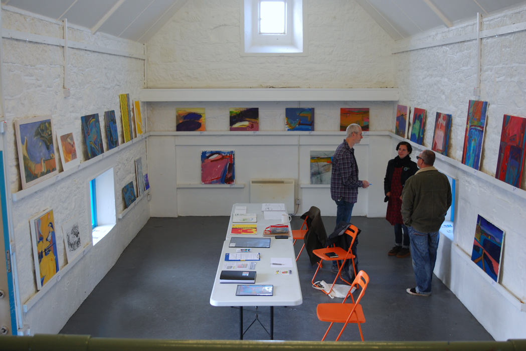
Around 2.30pm on Friday we put down our brushes (almost everyone - no names EA!) to clear the studio before hanging the show. This all went smoothly and we managed to show nearly all the work including Richard Barton's astonishing eight canvases. A very strong exhibition once again and to celebrate the achievements of the week we all went out for a delicious meal at The Square restaurant in Porthleven.
GALLERY
Testimonials
Great to be challenged to work quickly and try things out and keep moving painting along. Enjoyed having the history of the artistic contect, and particularly Peter Lanyon as back drop to working.
Elizabeth Aspinall
Always stimulating and thought provoking, not to mention challenging some preconceived notions!
Mitzi Delnevo
Ashley was very good at spending time with each individual and his comments and input were always very helpful. As a result I feel I made some very good progress during the week.
Richard Barton