Blog
- Details
- Ashley Hanson
 'Out-With'
Selected for 'Living With the Past' at Cupola Contemporary Art, Sheffield 15 July - 27 August
FRIDAY 26 JULY
Today I was able to look at 'Out-With' as a painting and I did get that charge that comes out of the creative process. I entered the studio with a stack of ideas for change but, sat in front of the painting, rejected them one by one: the painting is a statement. The only refinement was to put a veil of stronger yellow just in from the left-edge. We are done.
John Boyne's novel is about friendship in the worst of places. The story is told through the eyes of nine year old Bruno, who gives the name 'Out-With' to the place the family move to from Berlin when his father takes up a new post - as Commandant of Auschwitz. Echoing Anselm's Keifer's paintings of blond-haired Margarete and black-haired Jewish Shulamite - sourced in 'Death Fugue', Holocaust survivor Paul Celan's poem set in a concentration camp - Bruno's and Schmuel's fates are intertwined. In the horror of the final pages there is the balance of the tenderness of the two boys holding hands. In this painting, with the twin canvases, the power of colour and the stark imagery, I've tried to capture that balance between the best and the worst of humanity.
 'Margarete' 1991 Anselm Keifer
 detail
REFLECTION
'The Boy in the Striped Pyjamas'...A difficult subject for a painting, but I hope, like John Boyne's novel, the painting will provoke an emotional response, but also be a reminder of of one of history's darkest episodes.
To answer my question below 'Why am I doing this?', the main motive has been the artistic challenge. I don't do paintings like this: working with colour, 'The Art of the Senses', sourced in the places and books that I enjoy and in the excitement and uncertainties of the painting process. But what I have is a different painting, working out of a different set of emotions.
What is different about this painting is its' visual starkness. The journey across the painting from the yellow of love and warmth and light to the horror in the bottom right corner, reflecting both John Boyne's narrative and the reality of the fates of the millions transported to Auschwitz. The changes I made today makes this journey more graphic and emotional.
On Wednesday, the painting was certainly more 'beautiful' but perhaps an avoidance of the dark context. Today, like Bruno, I entered the camp, the session bringing me closer to the heart of the novel. The painting is powerful but there is guilt enjoying the rhythms of angles and different spaces in the depiction of the long grey buildings. I cannot avoid my role as an artist to create visual interest within the painting.
On a personal level, this painting experience has been cathartic but I am longing now to mix a beautiful blue and spread it across a fresh canvas, the beginning of a new painting in the '20 Books=20 Paintings' series...
 studio
THURS 25 JULY
A very difficult session, both technically and emotionally. Why am I doing this?
Bruno's house was introduced and a pattern/repetition of long grey barrack-blocks leading the eye to the black building on the right edge - the only building with a door. I've adapted the blueprint of Auschwitz and changed the orientation of the huts, to continue the key vertical stripe motif. The concrete fence-post now also becomes the the twin rows of electric fence that enclose the camp. It has been a challenge painting the gable ends of the huts without weakening the verticality. The huts towards the right are deliberately less detailed and solid, ending as simple vertical lines. This helps imply the dark grey on the right as a crematorium chimney. The accidental yellow marks on the right could be the two friends. No need to embellish the left-side - it is freedom.
 Wednesday
WEDNESDAY 24 JULY
Think on it: mixing beautiful yellows and greys for a painting about Auschwitz...
I may put hinges between the two sides, referencing both the book form and the horror of the closing door in the novel's finale. The hinged 'book' could be secured in a frame, an historical reminder or shown partly open...
Progress today: yellow stripes for the left-side, the colour of sunshine. The yellow accentuates the contrast between inside and outside the fence, an idea supported by the simple duality of the central image. The drawing has been refined, the curves creating a movement from left to right, echoing Bruno's journey. There is just enough space at the bottom of the tree/fence-post for a small boy to crawl under...
There are 'adult' complications and complexities I could introduce. An out of scale Bruno's (Commandant's) House at the base of the tree, positioned, as in reality, by the entrance to the camp, 300 metres from the gas-chambers. On the other side of the fence, an aerial view of the camp, with endless rows of huts and a dark indicator of the gas-chamber in the novel's final pages in the bottom right-corner. And/or the small figure of Schmuel, a concentration of tiny stripes amongst strengthened broader stripes. Another option is to hint at the window through which Bruno and his sister see beyond the garden and into the camp.
Or I can accept the simplicity of the central image as capturing the essence of the novel and work on enhancing the the colour and surface. Already I've been refining the greys and redrawing, seeking some kind of elegance, which feels strange considering the subject-matter, but these are the concerns of an artist. The initial greys were deliberately made from black and white but today saw the introduction of new greys around the fence-post made from Paynes Grey and violet, to compliment the yellows. My wife Denise - who is Jewish - commented that she loves it as a painting but her emotional response was that it didn't capture the bleakness and horror of both the novel and the reality of Auschwitz. This is more than a painting: my mind is made up- I think we are heading to that darkness in the bottom right corner...
 Tuesday
TUESDAY 23 JULY 2019
A wonderful, moving story about friendship, the innocence of childhood contrasting with 'civilised' adult values of dogma, duty and destruction. This contrast is the key to this painting. Grisly research: shocking concepts and images revisited, that somehow must be referenced in Schmuel's world on the right side of the painting. During the first session, I came up with the simple, hybrid image of idyllic tree and electrified fence.
The left-side will be beautiful colour, acknowledging Matisse, the antithesis of darkness. There may be further contrasts: luxury train and cattle-truck (with horizontal stripes), the Commandant's house and fetid barrack-block. Today was about grey, stripes formed by dripped-paint and gravity, with vertical brushstrokes through the liquid paint.
 The canvas awaits... 70x100cms
I was recently asked to produce a painting, sourced in the novel, for the North Cornwall Book Festival in October. From a list of authors I have chosen John Boyne, and his novel 'The Boy in the Striped Pyjamas'. This latest project will be an artistic, moral and emotional challenge.
Having neither read the book or seen the film, after hearing a brief summary of the plot, I immediately formed the idea of two worlds, one of colour, the other of black, white and grey, with the canvas divide representing the fence between them, with its imprisoning curved top cutting into the dark.
Choosing this book will mean revisiting horrors from my childhood, too young to see footage from Belsen on All Our Yesterdays. But I read - I had to find out, to understand but then wished I hadn't. I consciously avoided the episode on the Holocaust in The World at War as a teen and did so again on the re-run as an adult.
In advance of last years 'Black & White' workshops, I asked the participating artists to think about what black and white meant to them, symbolically, emotionally, formally. I wrote at the time: 'It’s the palette of the death-camps, chilling selections, black ss uniforms and horrors in a frozen white landscape'. My copy of 'The Boy in the Striped Pyjamas' has been lying around for a while - I've been avoiding it but now is the time to overcome my fears.
- Details
- Ashley Hanson
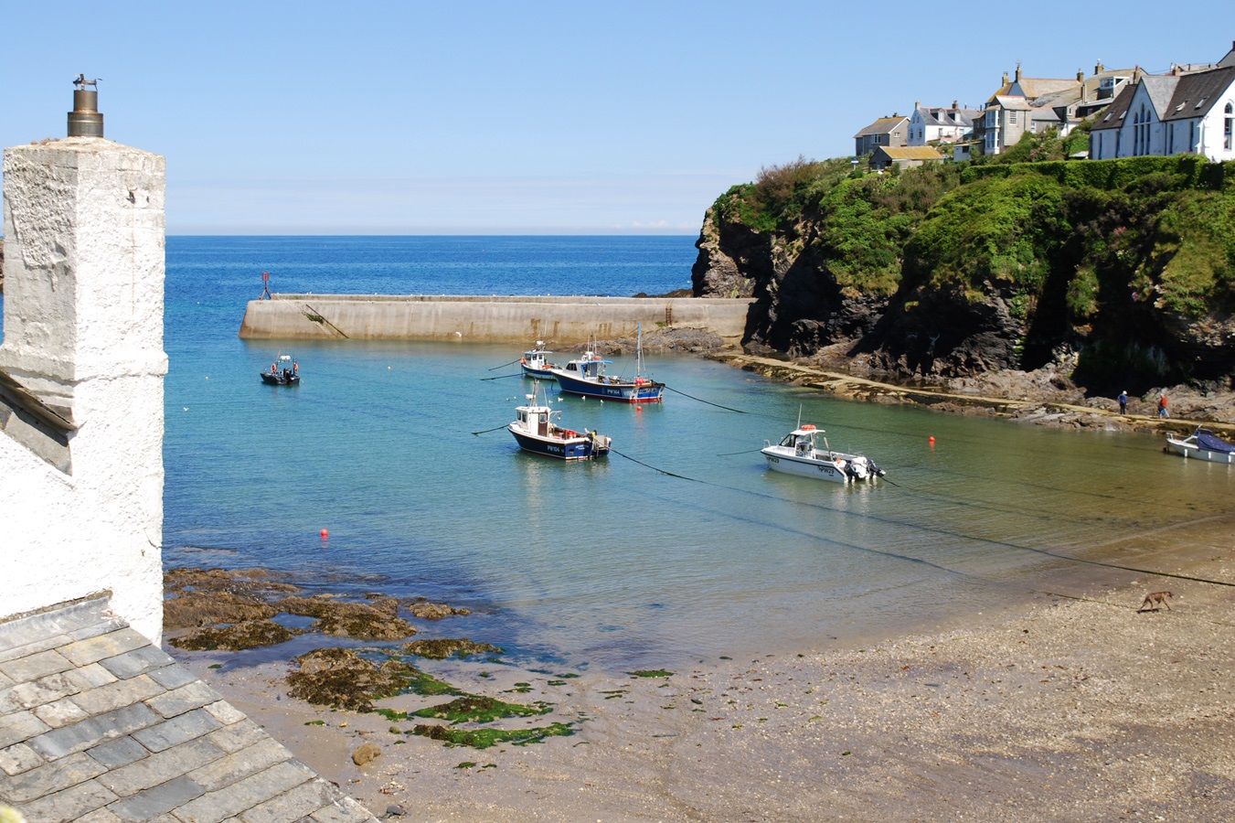
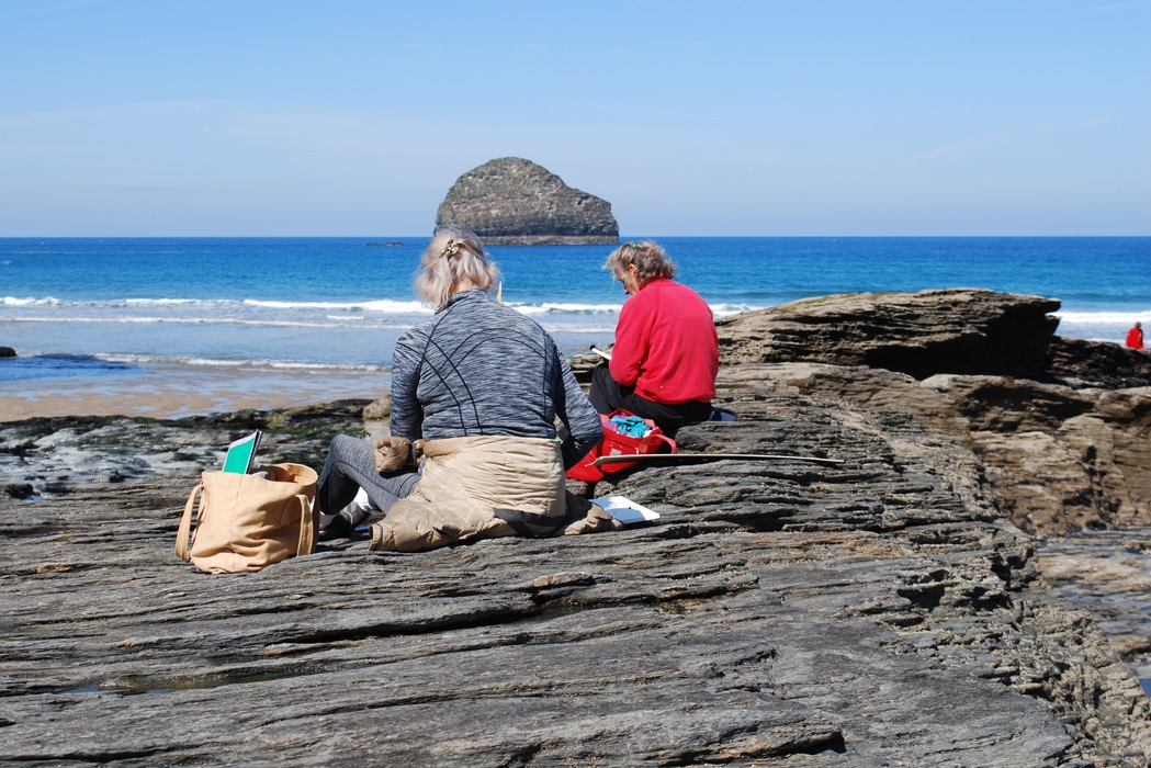
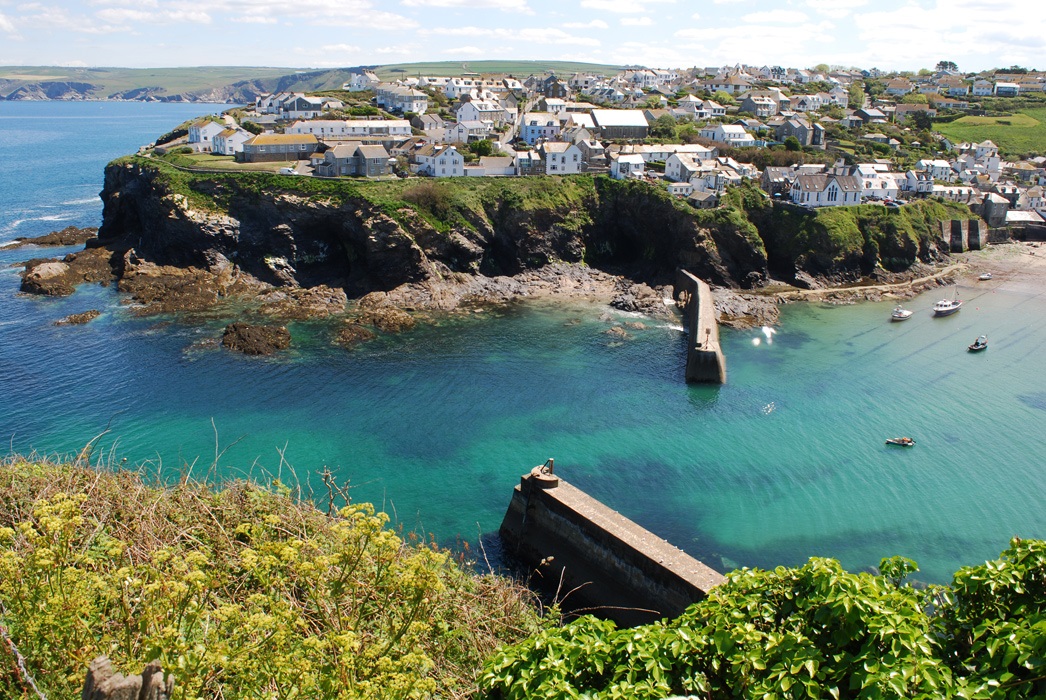
We were blessed with the weather on our May 'Freedom in Painting' course in Port Isaac! As on all our courses in Cornwall, we began the week with drawing on location, the nine artists from around the country gathering on Monday morning in beautiful, inspiring Trebarwith Strand, the skyline dominated by the imposing shape of Gull Rock. The purpose, as always, was to record and respond to the landscape, and its changes over time, and from that process, trigger ideas for painting.
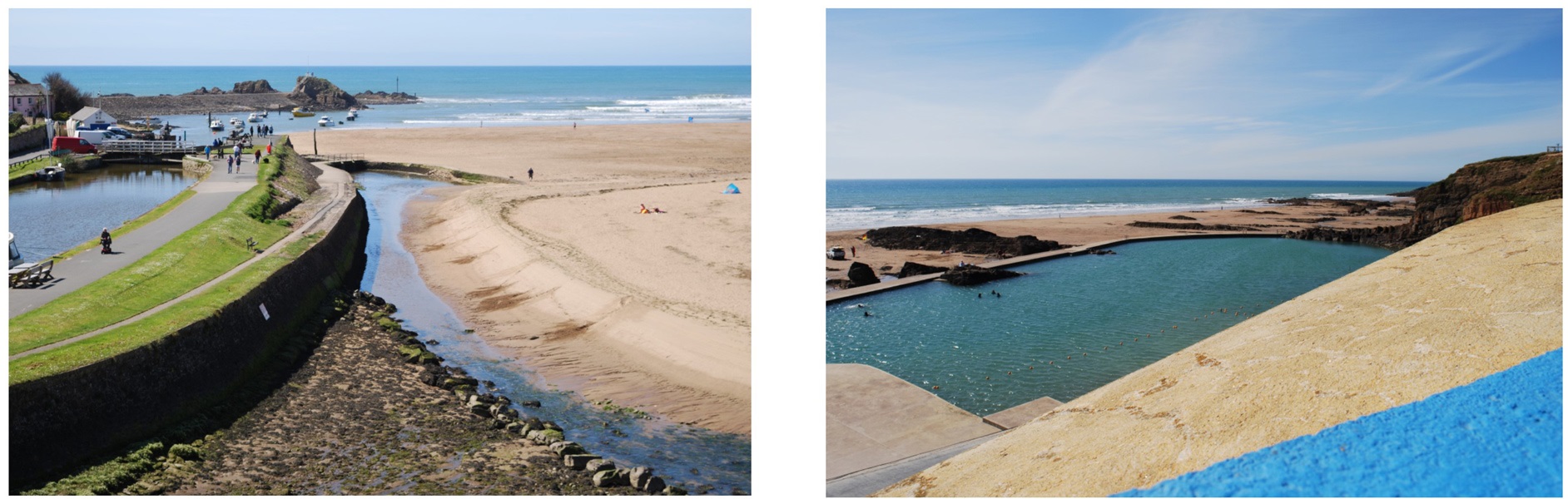
After a well-earned lunch at the Port William Inn, we moved on to the different landscape of Bude, with its expanse of sand, jagged rock formations and fascinating meeting of sea, canal and river. The geometric open-air 'Sea-Pool' (below, right) proved a popular subject with the artists. We also took a detour to Bude Castle, to see the exhibition and also my painting of Bude, made during a residency in 2014.
 'Bude' 70x50cms oil on canvas 2014
On Tuesday morning, we met in our studio in Port Isaac Village Hall, starting the day with a simple colour-exercise, taking a shape from one of the previous days drawings. The rest of the morning was spent getting to know our subject through drawing from the harbour and the many magnificent viewpoints around Port Isaac, again looking for ideas for painting.
The afternoon painting session included a demonstration and a talk about three different strands of abstraction, with reference to the artists of the St.Ives School: the lineage of colour, the analytical approach of Cezanne, Cubism and Mondrian, and expressive mark-making with its links to calligraphy. Different entries into painting, and over the next three days, as you can see from the gallery below, the artists pursued different routes, with overlaps of course, bringing clarity and personality to their subject.
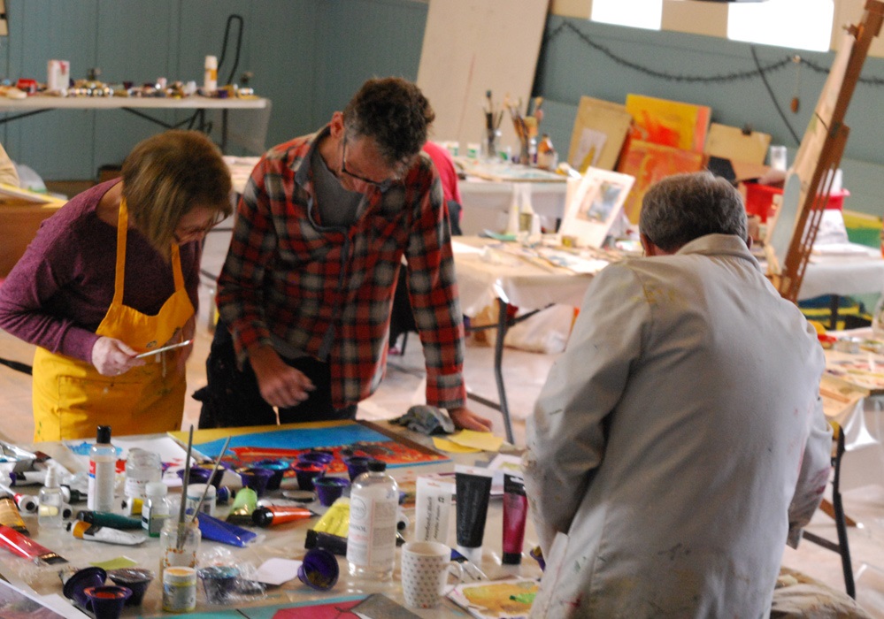
The course encourages risk-taking and experimentation in a supportive atmosphere. The aim is for the artists is to move their practice forwards: to be creative, inventive, ambitious for their painting and to have confidence and drive (and lots of drawings and studies!) to continue working from the subject when they return home.
Thanks again, Denise (Hanson) for some great photos.
(The dates for next years Port Isaac course are Wednesday 13 - Sunday 17 May 2020. While not yet on the website, please get in touch if you would like to reserve a place)
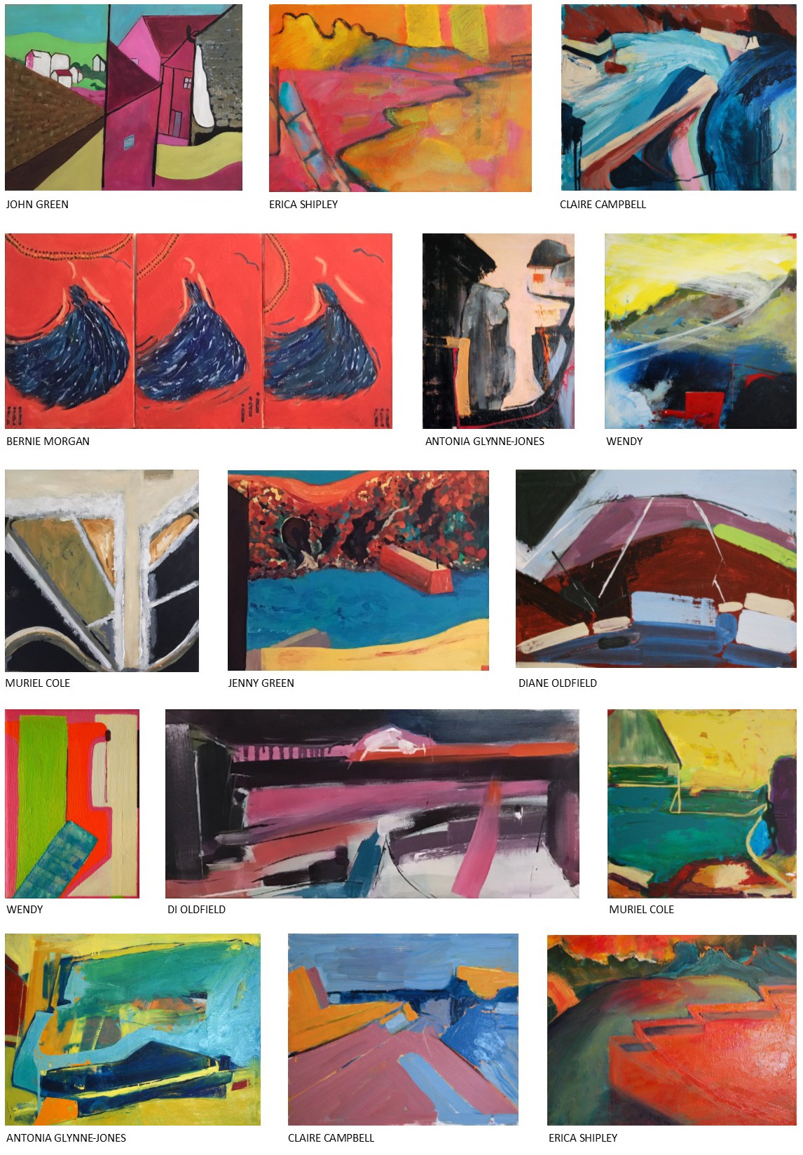
GALLERY
- Details
- Ashley Hanson
 (4)
(4)
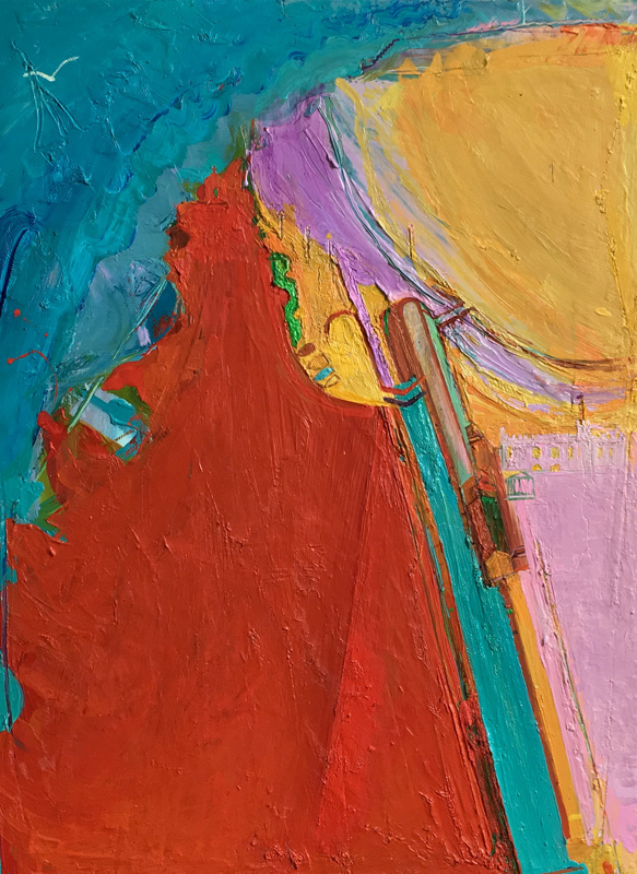
A new Port Isaac painting, perhaps closer to the subject than last years 'Cool Yellow Harbour- (Gang of Yellows)' which I felt was more of a generic harbour. A good painting nonetheless, and exhibited in the 2018 Winter Group show at Linden Hall Studio. This latest piece feels like new territory, with its twists and writhings and tensions, elusive imagery and singing colour.
The sequence below shows the chaos of (1) and the obviousness of the controlling pier in (2), which took away from the beauty and individuality of the tumbling marks behind. However, its near-diamond shape was a reminder of the harlequin-tiles of the framing wall in the viewpoint which sourced the painting. (3) was a contender, with the simplification and opening of the space, but then I had a vision in the night of the two diamonds - one open, one closed. Their placement, scale and density of colour made the space more complex, and brought the emerald stripe on the edge into the painting. The top colours came out for the diamonds: Sennelier Cadmium Green mixed with a couple of different Michael Harding blues...A quote from Matisse springs to mind: 'a painting is complete when it reconnects to the emotion that sparked it'. Something like that...
.
 (3)
(3)
 (2)
(2)

(1)
 viewpoint at the back of The Old Schoolhouse
 'Cool Yellow Harbour (Gang of Yellows)' 40x30cms 2017
- Details
- Ashley Hanson

BOOK 5: Re-visited Nov/Dec
New reds, new reductions brings a new clarity and a powerful painting...
 detail

(5)
MON 27 MAY
Changes made, painting sharper and more vibrant - we're done.
THURS 16 MAY 6PM
A six hour session in the studio - out of the black - liking this painting now, (5) driven by Fisherman's Blues and The Koln Concert. Strangeness: 'place' hanging from the significant tree, with its' blue box. Intersections of branches and streets connecting visually. An embedded symbol. There are some good reds in there but perhaps they have picked up too much black - I'll freshen them up in a few days and straighten up the edges of the black triangle.The blue mark needs to be a couple of shades darker, more cobalt... possibilities of a thin black curve springing to the top right corner from the nobble on the triangle's right corner...
A black & white colour-mixing exercise (1) becomes a painting...
 (4)
(4)
The painting at 3pm, (4) was a contender:graphic and strong, but too raw and not enough. The bottom reds kept sliding off! This forced a repainting over the black-lines, re-drawing, and freeing the triangle, with the refined lines sparking the idea of the introduction of the image of the tree, a third element from the novel.
 (3)
(3)
THURS 16 MAY AM
Darkness and despair! Looking again at (3), not as lost as I thought: we have a book, we have a place - the black triangle - the seeds of the idea are established - now to bring the painting to life...
 (2)
(2)
THURS 9 MAY
Sticky, oily blacks..this could be many things (2) An idea I explored today from a recent crime-novel didn't work with the location too obvious. But there is another book where black is significant...Love this stage of a painting with it's uncertainties and possibilities, working with paint that is alive...let's build around the point of focus of the bright green disc...
 (1) beginnings...
- Details
- Ashley Hanson

SUN 3 MAY
A good session in the the studio today. The painting is joyous, playful, different, the colours a higher key - we're done. The swimmer has always been there (by chance) and I have suppressed/denied the thought but I find I am enjoying the switch from image to abstraction and the painting is richer for it. Today's moves: a balancing purple disc, then several reworkings of the bottom right corner - which I considered too flat - until I found the orange shape/plane. Beyond the enjoyment of colour, shape and line there are Porthleven references if you seek them but I'm happy with the 'hints of structure and telegraph wires'. Very exciting to see the four new Porthleven paintings as a group (bottom of page). Now to find somewhere to show them...


SATURDAY 2 MAY 2019
I don't care much for beginnings, but the one below is quite tasty with yellows, primrose/emerald green and a pink cup-shape, lifted from my painting 'Falmouth' that I've been looking at in the COLOURSCAPES exhibition. I think we have advanced with the introduction of line and simplifications - hints of structure and telegraph wires. Love the pink-shape and violet-white curve, and the movement from bottom to top...

 'Falmouth' 50x40cms

(L-R: Porthleven 34, 35, 37. 36)