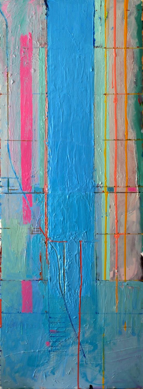
 COG 27 - VERSION 2 160X60cms
VERSION 1 was shortlisted for the 2015 National Open Art Competition and VERSION 2 shortlisted for the 2015 Royal Academy Summer Exhibition.
FINAL THOUGHTS: 30 NOV 2014
''What is not possible is not to choose' Jean-Paul Sartre
All the artists on the 'Freedom in Painting' courses will recognise this quote, often nailed, Luther-like, to the studio door. However, with this piece, with the two versions, two solutions, I have decided not to choose, because i believe they both work in their own different way. I find it exciting that with one screw, and the removal or addition of the , 'roof'', I can make the severest of editing, and make a very different painting. We have had the 'roof'' on for a couple of days, now it's time to take it off and enjoy the 'interior' of the apartment.
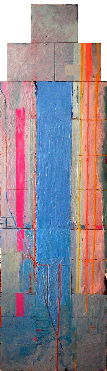 COG 27 - VERSION 1 200X60cms
I have however, been decisive with the title: after toying with 'The Space Between', it is now simply called 'The Stillman Apartment'
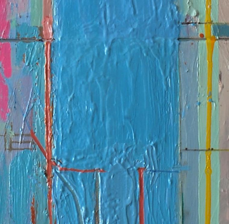
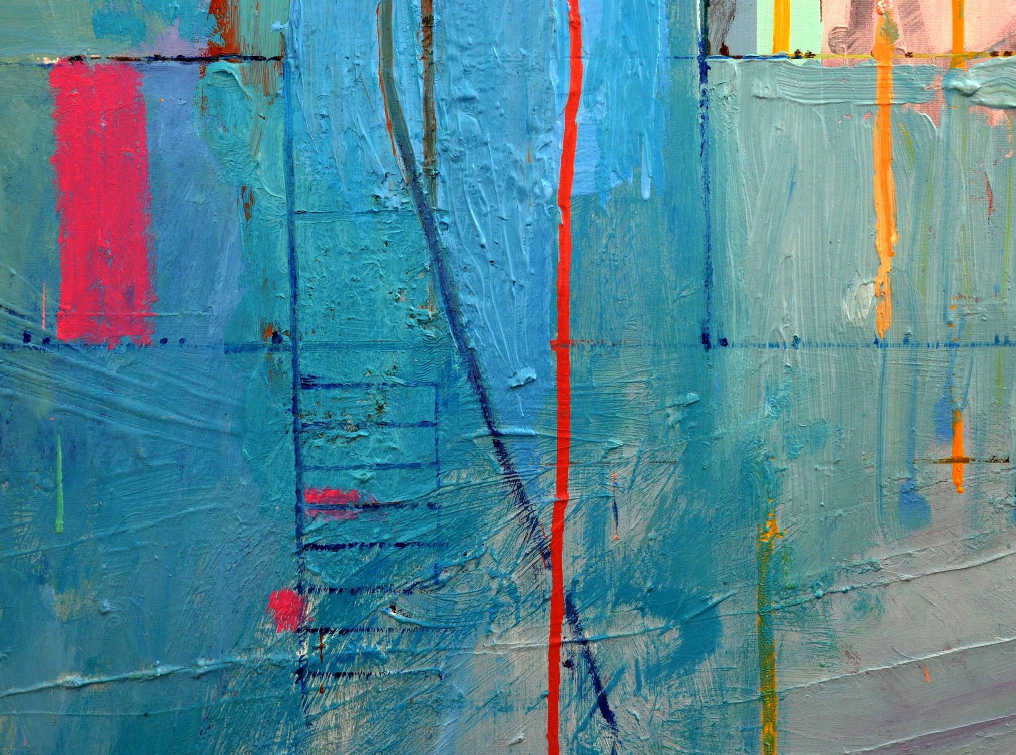
'The Space Between' is the theme for the forthcoming Canterbury workshop and the words and concept have been constantly in my thoughts in this piece. I was in St.Ives, Porthleven and Falmouth yesterday, enjoying the moment but painting in my head, ideas, colours, words, compositions. Smaller canvases next - I wish to make something as powerful as the blue in 'The Stillman Apartment'...the detail below gives a clue to the direction I'll be taking.
This painting happened because I was in the studio day after day - it is the only way to work, to focus. I had a fascinating talk with curator Charlotte Davis yesterday. She organised and participated in a 24hr drawing workshop. It is a bizarre concept but poses many questions: is it possible to focus for 24hrs? Because of the intensity will new things emerge? I'm thinking of taking part in the next one, working on a painting for 24hrs...catch a train home!
27 NOV 2014
It has taken a while but the latest 'City of Glass' * painting has emerged with satisfying ambiguities. there are even two titles, two ways in , even two possible solutions (I removed the ziggurat top section but its worth another look now the painting has moved on). The blue block is of course Central Park, the 'space between' West Side and East Side, but continuing the themes of the series and my interest in the play between the plan-view of New York, the grid of the streets and frontal view. i have also made Central Park an entrance, a gateway to the space beyond. During the process I had the figure of Stillman walking through the opening but the idea never worked. Colour replaced image, much more intriguing, the last of my Williamsburg paint - Sevre Blue and Courbet Green- boosting the intensity of the block at the southern end of Central Park. I am still coming to terms with this piece - it inhabits the space between abstraction and figuration but the blue is something else, something sensuous, seductive and indefinable.
The dividing line between the canvases is 69th St, highlighting the location of the Stillman apartment but the painting can also be read as an interior, inside the apartment. referencing Matisse's 'French Window at Collioure', the blue block is an opening, a view to outside, but the denseness and emptiness of the negative space dominate. The blue is both inside and outside. 8,7,6,5th avenues below Central Park become a balcony. I love the uncertainty of the definition between vertical and horizontal planes.
In the alternative ending,(VERSION 1), you lose the idea of being inside the apartment but the ziggurat-topped tower is the apartment building on 69th St and links to the Tower of Babel in the story. With the severity of its' shape, the increase in greys and the abrupt ending of blues at 110th St, the tower-shape is oppressive, resonating with the darkness in the novel and with the atmosphere inside the apartment when Quinn meets Peter and where of course the story ends. This version is more about image and claustrophobia, VERSION 2 more about colour and the senses.
I love the idea of the two alternative endings/versions. It happens in literature, in the novels of John Fowles, 'The French Lieutenants Woman' and 'The Magus', (John Fowles) and in film, the two versions of Apocalypse Now! - why not in painting?