 City of Glass 9 - (Fiction & Fact) 120x200cms
19 FEB 2013
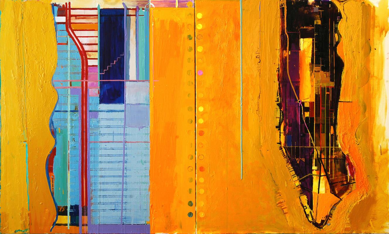
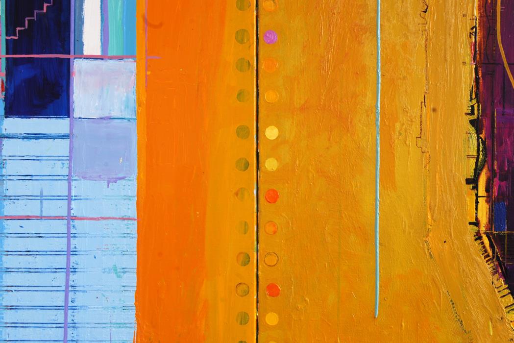
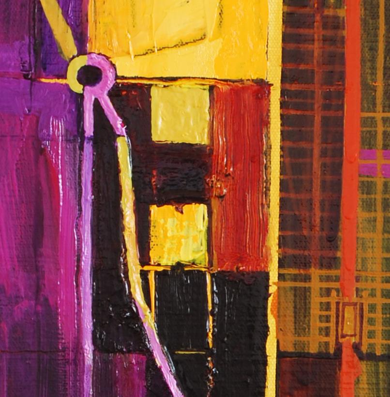
The painting was resolved and the two sides pulled together when I put in the blue-grey drip vertical in the right side painting.The drip stopped in the perfect position. Love the division line between the canvases and the power of the pink dot (which is no longer an attention seeker but an incident in the whole).The other dots/perforations were repainted to bring back their shape and clarity and reinforce the idea of the opened notebook. Curiously by putting in the long blue'grey vertical there was no need to extend the pink horizontal from the left-side into the right. The eye picks up and connects the existing horizontals and the repeated motif of the large rectangular block of Central Park. The eye is tricked: the large blue rectangle is not Central Park (which of course is the large orange rectangle to the right). The blue/grey line is just enough to suggest a building and moving across the painting into the left-side, the orange rectangle of Central Park becomes an almost identical building (the Twin Towers?) and the left-side can be read as architecture/buildings/skyline - buildings that are there but not there. The verticality of New Yorkimplied in the grid-pattern of the streets. There is an interesting feel about this piece: scale orientation/viewpoint are all subverted and ambiguous. Painted facts and painting-truth derived from fiction.
 detail 1
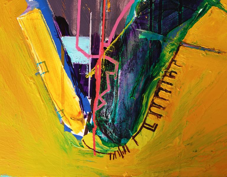
The letters that spell T.H.E.T.O.W.E.R.O.F.B.A.B.E.L. are all there on the right 'fact' side - map-truth (though it depends on which map you are looking at), letters that are there but not there, looking for them turns the viewer into a detective. On the left-side, I had intended to transcribe the letters invisibly written by Stillman's walks, superimposing them on top of each other and spiralling around their start-point, the Hotel Harmony. However, once I put down the grid and the painting began to develop, this seemed unnecessary, with the off-straight purple line, the drip that misbehaved (and the missing cross-streets) providing the fiction. I am certain the original idea will re-emerge in another piece with a simpler background. There is a rawness about the paint on this side but this is tempered by the discipline of the grid.
There are links to the other paintings in the series, particularly 'City of Glass 2 - (Hotel Harmony)' where a section of the Upper West Side, with the curve of Broadway, sits alongside Manhattan. Also 'City of Glass 4 - (Truthville N.Y.)' where the dot of Truthville sits on top of the Tower. While Paul Auster's novel 'The New York Trilogy' is the inspiration for the painting, I am also indebted to Mondrian - I have long admired the purity and beauty of his later works. , their asymmetric balance and the exquisiteness of their execution. I can also see connections with some beautiful books made by artist Ruth McDonald, about her journeys in Cornwall and Kent, that I saw recently.
The next piece will explore the novel's multi-layers of identity. There will a figure - Stillman - who will be covered by six layers of human shadows of increasing size representing Max Work (Quinn's fictional detective whose persona Quinn adopts on his assignment), William Wilson (the pseudonym Quinn uses for his detective-fiction), author Paul Auster (the creator of Quinn), myself, the artist and creator of the painting of the novel, and finally the viewer. Ideally this piece will be lit in such a way that the actual shadow of the viewer is superimposed on the shadows in the painting.
Already I can see the shoulder of the figure of Stillman jammed up alongside and following the curve of Broadway...
I have been looking at the description of Stillman in the novel for my painting: tall, white-haired, a long shabby brown overcoat...and then today I met some friends In Falmouth and Simon Bor was wearing....a long shabby brown overcoat. I took some photos..a perfect Stillman (not that Simon is old or white-haired!. I have used a similar figure before: on a red-hot summers day in Blackpool I saw an elderly gentleman in an overcoat, hat and scarf. I took a photo, named him Harold Parkinson, and he appeared in several paintings at art college in the early eighties. Love these connections.

in the studio
SAT 16 FEB
Frustration! This is so difficult to see. I was hoping to be in a larger studio but it hasn't worked out. Nevertheless, this is challenging and exciting to make this work as a diptych and read as an open book. There is a beautiful symmetry and linkage between the curves of Riverside Park in the left-side and the curves of the East Side of Manhattan on the right-side. The line where the paintings join is very powerful. The piece needs a building, a Tower of Babel - there is the suggestion of one with the ziggurat-shaped in the left-painting but I might make more of it. The large tall vertical on the right side of the left painting represents Central Park but I'm thinking of introducing a similar-sized block on the left side of the right painting so that the blocks read as the Twin Towers, exquisitly divided by the physical divide of the paintings. The painting needs a strong unifying horizontal: I'll make the pink horizontal of W100St pop up from behind the towers and either cut across Manhattan in thre right painting or go behind, cutting the space and de-flattening the painting. The pink dot is no longer an issue - it is an incident in the whole. The lines of dots/perforations will work better when they are more regular and straightened up.
27 JANUARY

beginnings
 detail - 'City of Glass 6 - (Pages 106-112)'