Blog
- Details
- Ashley Hanson
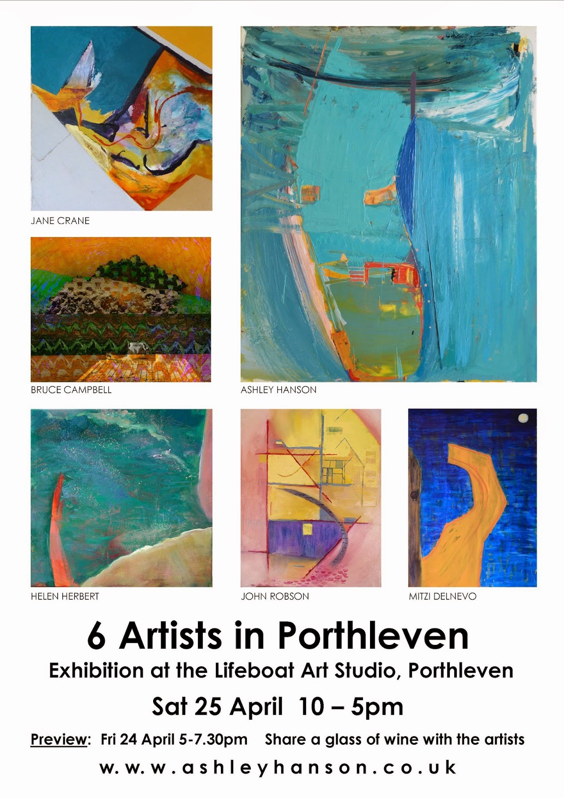
You can feel the excitement in the air already down in #Porthleven as they prepare for the Porthleven Food & Music Festival. We are really looking forward to it - especially with our exhibition coinciding on the same weekend. Hope you can get to both!Come along to the Friday night Preview 5-7.30pm (just before the Hayseed Dixie band are live on stage 7pm ) or the next day, Saturday 10-5pm. Ashley and our experienced artists will be working extremely hard all week - looking forward to showing their work in the exhibition.
The exhibition is in the Lifeboat Art Studio, next to The Ship Inn on Mount Pleasant Road by the harbour.
- Details
- Ashley Hanson

DAY 5
The stars went in, an Alizarin glaze on the pink block, a couple of additional lines, tried and discarded, and it was done. This magical moment, when the painting says STOP! is unexplainable, intuitive, based on knowledge only up to a certain point because this is a new thing. Ideas, process, probing, testing, melt into pleasure, the senses.
Familiar themes of the grids of architecture and the street interlocking, a building 'there but not there', now you see it , now you don't. A rare sky, both inside and outside Grand Central station...fake sky, fake constellations, fact & fiction. The curve of the sky is the new thing, echoed by curves within the painting. The stalagmite orange line pulsates, the proportion and arrangement of the rectangles feel right, glowing with colour, one with light. A window? I love the strength of the intersection of the long horizontal and vertical,(42nd St & Lexington Ave), almost making a painting within a painting but then not. The eye is led upwards. The familiar figure of Stillman from 'The New York Trilogy' * appeared at one point, two Stillmans, blue left, brown right: there are few traces, edited out, but they forced the issue and moved the painting forwards- this painting is about something else.

DAY 4
Colour is happening and a more complex space. None of the usual colour horrors bringing it into the daylight. The dominant vertical that emerged - (Lexington Avenue) is on the Golden Section, as is the 'horizon' line. Over 30 years, I can't remember ever using these proportions deliberately/consciously, though I guess they have appeared. Together with the curve of the sky, the painting makes me think of ' The Baptism of Christ' by Piero della Francesca, with the weird hovering bird. Looking at the two paintings, there is also the strange co-incidence of the angled leg of the figure on the right and the diagonal in my painting- spooky, almost a reverse image.
The constellations/letters are going back in tomorrow and refinements adjustments of the verticals and horizontals.


Early days...the sky will be the deepest blue, letters hidden among the constellations in the vaulted ceiling of Grand Central Station....ghost avenues.....the 'scaffolding' of the streets still raw.. the dual carriageway of Park Avenue pointing to the heavens, also the radio tower atop a half-hidden building... * a novel by Paul Auster
- Details
- Ashley Hanson

'City of Glass 29 - (Babylon)' 100x75cms
TUES I've had a change of mind- 'Babylon' is the title of the painting.
MON I have been looking for hours at this piece- I think it is resolved. Denise is not sure but Ollie says it's his favourite.
Any more additions/complications will detract from the strength of the bricks running through the image of Manhattan. I've simplified the yellows and Central Park and put in the rivers of New York, adding a curious drawn, linear element to the painting. Now I have, like the novel*, a mix of the ancient and the present day. Manhattan sits, like Babylon, between two rivers, the bricks/canvases and image within reminiscent of the friezes of the Ishtar Gate. The shape of the canvas relates to the ziggurat-shape of the Tower of Babel, which is, of course, made of bricks. The only dilemma is the title: 'Babylon' or 'Tigris and Euphrates'.


The usual horrors when I took it out of the studio into natural light. The yellows are crude and the surface too knobbly and complicated. The bricks/canvases must be more prominent - I'll gouge out the paint in the cracks. Am liking how the Manhattan shape site in the shape of the piece, the pinks are doing something and colours and paint in the Lower East Side. It's not enough- back we go.

Day 2I had to go to work today- so just a couple of hours in the studio. Colour is starting to happen and bricks/canvases more prominent. Manhattan image emerging. The larger bricks will be broken down into smaller bricks with the proportions of a New York city block. Manhattan will be covered with a brick pattern instead of blocks- made of bricks like the Tower of Babel. I think the scale is going to be 1 brick = 6 blocks, hence the new title. The painting takes on the idea of the enormous scale of the new Babel, where every inhabitant of North America will have their own room...... Think again of the words: 1 brick is the size of 6 city blocks... My daughter Faye likes the colours.

Day 1


* 'The New York Trilogy' by Paul Auster.
- Details
- Ashley Hanson
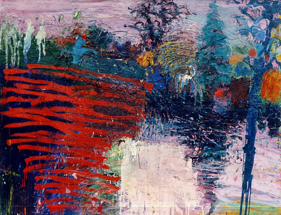
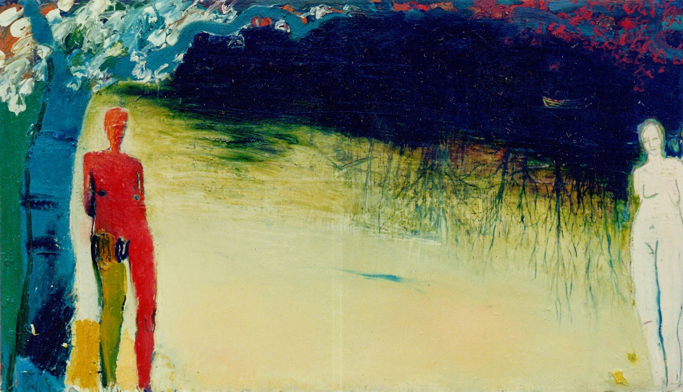
In the Park' 165cms x 210cms
Having a look at these early, emotionally charged paintings again recently and seeing how they stand up over time, how strong they are, I feel now is the time to tell their story- especially because of the links/references to the Garden of Eden in my current 'City of Glass' series. Reflection: in each life there are many different lives - back then I was not yet fully formed as an artist or a person but this series - (painted between 1984-88) - gave a few more clues to who I was. There were many influences: the paintings of Edvard Munch, John Fowles's novel, 'The Magus' and music: Joni Mitchell's haunting 'Hejira' ' there is comfort in melancholy, no need to explain.....' and the title, 'The Fear & Thrill of the Chase' from 'Decades', the final track on 'Closer' by Joy Division.'
...here are the young men the weight on their shoulders.....
'I left Canterbury College of Art College in 1983, moving to London and sharing a flat in Battersea, near the park, with a close friend from college. The house next door was derelict and the top floor became my studio. It was Year Zero- time to start again- how much of what you make at college is truly yours? The first paintings- since destroyed- included the power station but it was the park that became the inspiration, providing the setting for the paintings. The paintings are about an idyll, about friendship and desire, the inarticulate self, communicating emotions through paint.
'In the Park' (above) shows river & lake, a mixture of aerial-view and looking through trees. A group of friends in the top left, and another hidden figure behind the off-white shape that establishes the foreground. It is the same figure- the rear view of a man in an overcoat - that appeared in my college paintings and re-emerged as 'Stillman' in 'City of Glass'.
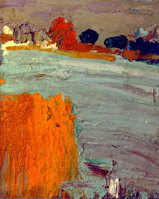
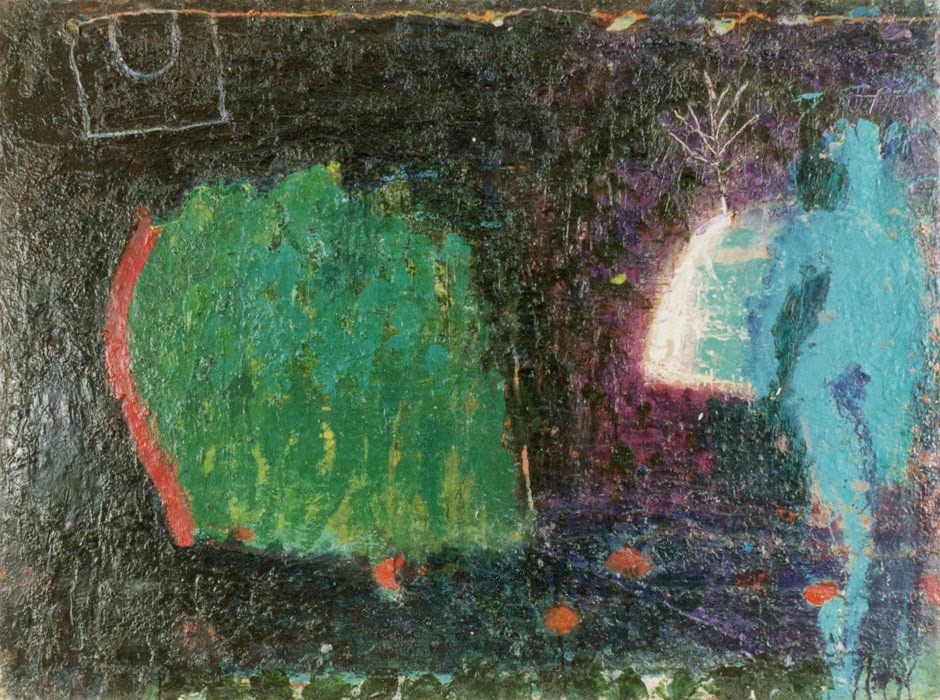
'The Lake' 90x72cms
'The Lake', with the fiery willow tree, started off as a picture of a girl, the reddish bush in the background was the back of her head. (She reappears later). I still think this is my best ever depiction of weather and water. In parallel, there was a painting of the lake that became a figure painting, sadly lost.
'The Garden of Eden' 175x300cms
On the lake-edge I found a tree where a branch had been removed, leaving behind a perfect heart-shape. This became the setting for a painting about love, despair, desire and deception. What I took from 'The Magus' was the idea of the masque and the manipulations of reality and fantasy. Is the girl real or an ideal? - the statue/girl a devise for disguise. The motif of the yellow boat, scratched into the paint and surrounded by text, is taken from 'Melancholy' by Edvard Munch - in some versions it is called 'Jealousy'.......The heart-shape and the snake and the erection were all painted out - too obvious- leaving something raw, starker, bleaker- the message in the painting the enormous, empty space between the two figures.
The building reflected in the water is the pump-house, now a gallery, where we used to go late at night after a few pints. We also used to 'borrow' the boats and row out to the island.
'Southolm St, SW11' 30x20cms
The house on Southolm St was surrounded by railways and although the park was a few minutes walk away, I considered the railway-bridge/arch at the end of the street as a gateway, an entrance….. The upside-down arch became a motif, a reflection in the lake. The figure is probably myself, the house wasn't pink and there was no tree.
'The Girl' 180x60cms
The bleakness of the 'Garden of Eden' was followed by a triptych of near life-size figures, boy on the left, girl, on the right and in the centre an embrace. All that remains is the painting of the girl and the face of the boy-figure, transformed into 'The Tree'.
'The Girl' was originally called 'The Awkwardness of Nakedness or The Look That Destroys Men'. Reality and fiction intertwined again, another John Fowles connection, this time a look that Sarah (Meryl Streep) gives to Charles (Jeremy Irons) in the film of 'The French Lieutenant's Woman'.
It is has been cathartic, looking back on these works and my life, as it was, contained within them.
 'The Island' 60x90cms
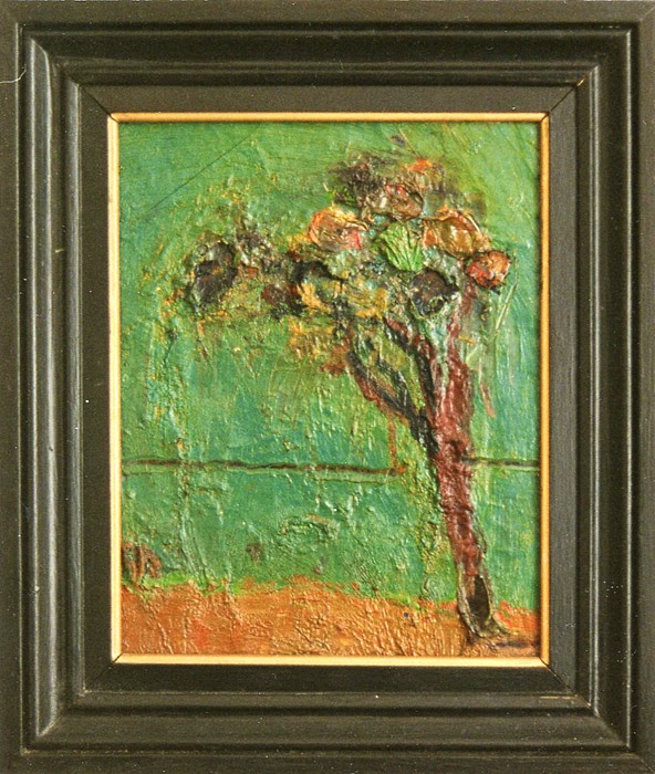 'The Tree'