Blog
- Details
- Ashley Hanson

SELECTED FOR BLACK SWAN ARTS OPEN, FROME. 15 JULY - 11 SEPT 2022
A painting that personifies Matisse's theory of a painting being resolved when it reconnects with the emotion that sparked it. My interest in the coastal landscape is the interplay between geometry and movement - in this case, the catalyst a white building with a triangle of blue between chimney and roof and a wind you cannot see. But this painting is also about the three-dimensionality of sky - a rarity in my work. I remembered Robin Greenwood writing about the spatial complexity of Constable's skies in Abstract Critical and the phrase 'architecture of sky' sprang to mind but not the source. Google led me to this poem by Claudine Toutoungi - perfect.
'the architecture of sky
is the song of a robin
whose Cubist grammar
is holding us up'

The painting evolved from a demonstration of gestural mark-making in the recent Port Isaac painting-course (1). How to transform an exercise into a painting? My subject (and contrast) are imposed on the painting: the wrong green leads to the red.(2). Hints of landscape. Orange lifts the red.
A dissatisfaction with the eye led downwards with the green provokes a flirtation with a change of orientation - but instead, the spring of the cut line curving upwards through the refined blue, topped by a balancing blue mark in the top-right corner, brings the painting to life.(3). The space is further opened by carving out the weighty red but the graphic chimney is an alien language for this painting (4).
A re-look at the subject brings clarity and purpose to the painting with the addition of a startling blue and a fast, leaning mark through the 'chimney' which makes the space even deeper. Now I can feel the wind...

- Details
- Ashley Hanson

29 MARCH 2023
A re-visit nearly twelve months later, working the blues and yellows and fixing the orientation! The harbour-shape is no longer a boat-shape, which niggled me and now sits better in the rectangle.

MON 18 APRIL
I couldn't wait to see the painting this morning: any changes needed or refinements or can I simply enjoy the painting? Had fun trying different orientations and both these versions below seem to work too. On the left, my harbour sleeps gently while on the right there is a sensation of falling, dynamism and danger, more uncomfortable to look at but nonetheless thrilling. The purple curve seems to hold everything up. But I am going to stick with my original choice above, which has its own unease and beauty and a feel of landscape, and in terms of the series, is more surprising.

SUN 17 APRIL 2p.m.
Simplification: the harbour sits on a weighty Cerulean based blue and red re-drawing brings a solution. A delicious downward slant/slide from the top-left and twin counter-slants provide a tension and a title. The cut-mark on the right, with its sharpness and difference does a sensational job for the painting, bringing the eye back in.

SUN 17 APRIL a.m.
The horizontal green mark that takes out the orange corner brings a change of orientation (5). Dramatic drawing opens up the painting: the rose and Cadmium yellow mix is a good match for my 'sea' colour. Inside the harbour-shape, the colours are too warm, too drab, the marks too complicated. Replacing the harsh yellow with the purple curve (6) has made a huge difference. New purples now enter the middle harbour.
SAT 16 APRIL
'Until it is resolved, a painting is a live thing, full of possibilities...' . Looking for a palette, looking for space, looking for a shape/harbour to activate the rectangle. An early idea, in (1) & (2), which I might go back to, is to have two harbours, one high tide, one low-tide. After a few recent yellow paintings, I have an urge to work with blue this time. Loving the Cerulean/Emerald sweep and the twist to the top-corner is interesting in (4) but the colour- relationship and balance is wrong and all is too flat/cut-out.

- Details
- Ashley Hanson
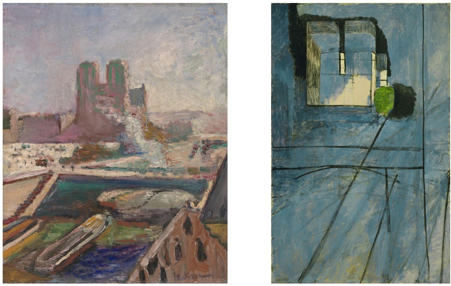
'Matisse & Notre-Dame' was the theme of the recent 'Freedom in Painting' online painting workshop. I have long cherished the two paintings above, which bookend the series, and I enjoyed the discovery of several more works painted from Matisse's apartment on the Quai Saint-Michel. While, perhaps, the series cannot be compared to the greatness of Monet's paintings of Rouen Cathedral, Matisse's series provides one of the most iconic and influential paintings of the 20th century ('View of Notre-Dame' 1914, above right) and shows us his influences and development as an artist.
 Jane Crane's studies and paintings
The workshop began with a Powerpoint presentation of the Notre-Dame series, highlighting the influence of Cezanne and the move away from Impressionism. We also looked at the work of Marquet, who painted similar views of Notre-Dame, Matisse's methodology of producing two strikingly different versions of a painting and the influence of Matisse on the work of Richard Diebenkorn.
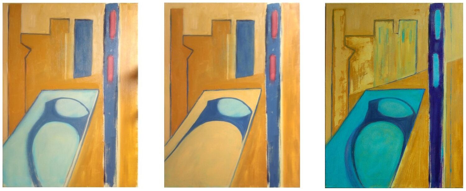 The 3 stages of Jan Bunyan's painting
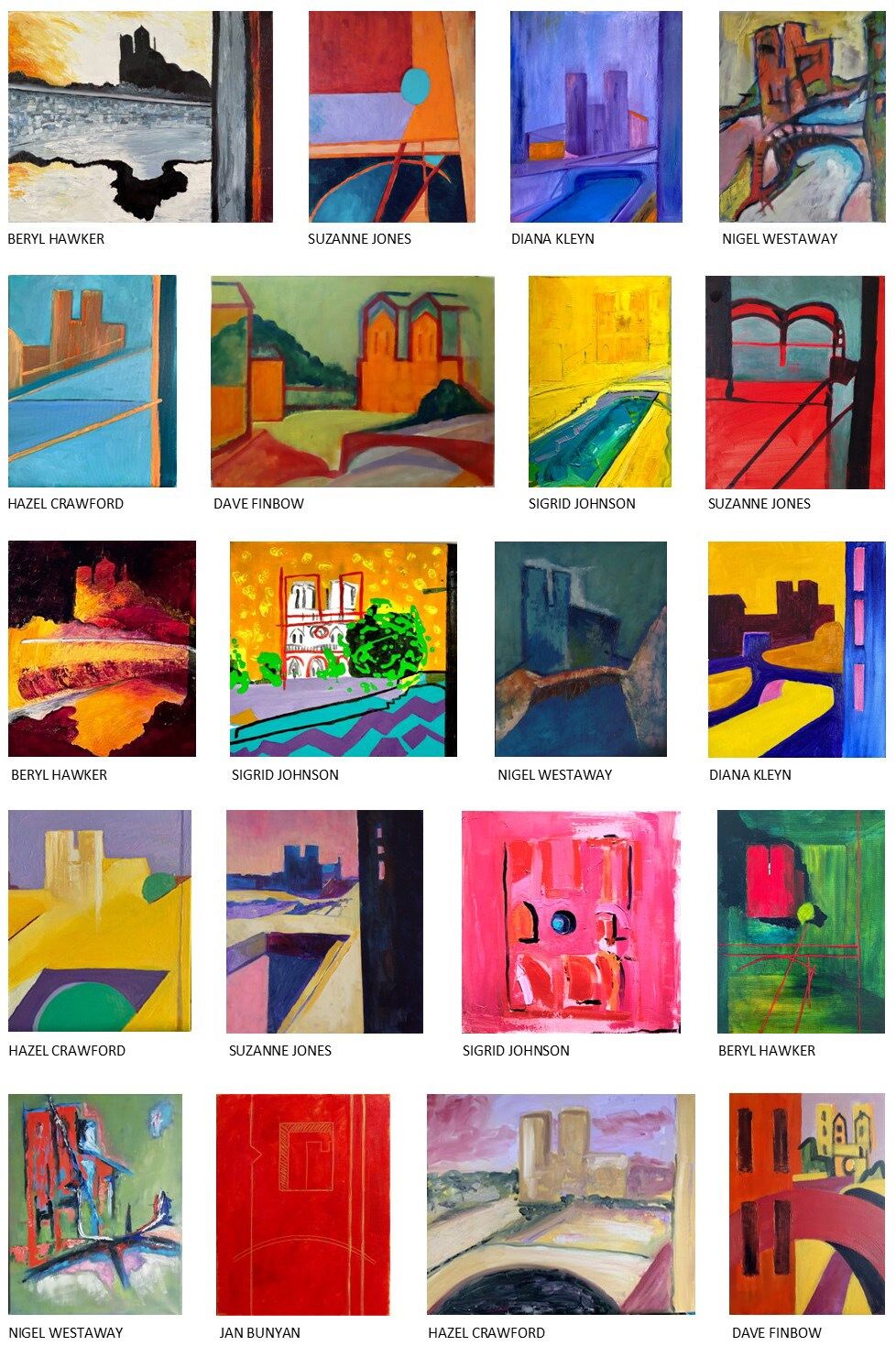
The artists were asked to produce several quick drawings from their favourite Notre-Dame paintings to find templates for their own interpretations. Throughout the workshop there were demonstrations - we had a second camera facing my painting - and individual tutorials each day where we discussed ideas and the progress of the paintings. Towards the end of the second day, the artists emailed me images of the latest versions of their paintings, which I put together in a Powerpoint for our Group Critique.
As you can see in the Gallery below, there was an exceptional response to Matisse's series with some amazing paintings produced over the two days - hats off to the artists!
GALLERY
'Ashley’s workshop is so complete in subject and content, the itinerary is brilliant.' Diana Kleyn
'It was the best yet! It’s hard to say what the best bits were - it was all great. Ashley, your way of doing online workshops is just brilliant! You make it personal and encouraging with the tutorials and your teaching style is relaxed and inspiring.' Beryl Hawker
'Totally brilliant two days...my art practice feels like it's gone up a notch...huge thank you Ashley!' Jane Crane
- Details
- Ashley Hanson

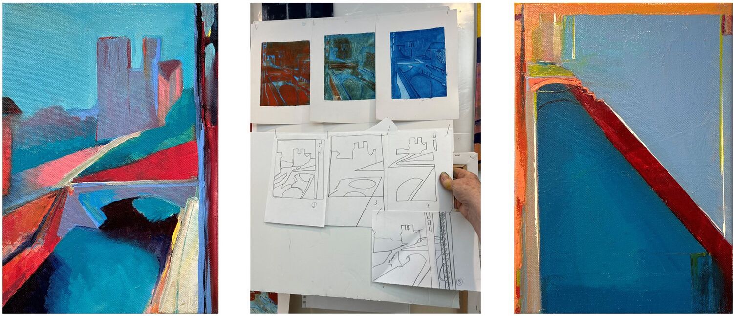
A painting inspired by Matisse's 'Notre-Dame' series, the subject of a recent online 'Freedom in Painting' workshop. My process is to sketch out ideas or draw from the subject, in this case from Matisse's paintings, and then draw from the drawings, looking for specificness and structure as a catalyst for a painting. With my Notre-Dame painting, drawing 5 below was my template. I chose a new oil-colour to work with, Michael Harding's 'Indian Yellow (Red Shade)', which I paired with purples, a palette sourced, perhaps, in Matisse's magnificent 'Notre-Dame with Violet Walls'.
In the finished piece, clarity and precision of drawing and colour emerges from the more chaotic earlier version below. The right-hand purple vertical is also necessarily straightened, referencing, of course, the window in Matisse's apartment on the Quai Saint-Michel. I hope my painting reflects the dynamism and emotive colour of Matisse's series.
 in progress

 detail
- Details
- Ashley Hanson

In a departure from the 'Beach Huts' series - though there are links - the discipline and enjoyment of a 'Pure Abstract' painting. But what is 'Pure Abstract'? A self-contained painting with no image or reference to the outside world? Is that possible? In this case, the triangle, circle and square become the 'subject', their placement & relationship, scale, colour, application, difference, the essence of the painting.
I've loved making this painting, a pared down version - 'abstraction' - of what I normally do, just three elements to work with and the emptiness of the ground. The orientation was quickly resolved, the red circle moving upwards from the bottom-edge. The breakthrough was freeing up the shapes and allowing them to float within the colour-field, with the more subtle internal frame helping the movement, dragging the shapes towards each other. Does this follow the principles of Clement Greenberg? - this painting is tactile not flat, the hand of the artist evident, not disguised. A painting of doubt and refinement and search for 'painting-truth'.
Is this 'Painterly Abstraction'. Does it matter?
 in progress